It’s been a while.
This website has been on hiatus for a year because I wanted to redesign the website in a way that felt like me. Little did I know that it would be a very long and indecisive nightmare for myself. I mostly stopped drawing and writing blog posts because of this, thinking “There’s no point to creating if there’s no outlet to publish it.”, but I later realized that I could’ve just continued making them, save them until the redesign was published, and I could’ve easily packed it with content from launch day. Well, at least the shackles have been lifted now that the redesign is complete.
This post will be a showcase of every unused redesign I’ve made over that past year and why I rejected them. Most of the time, it chalked up to a good concept, but bad execution. Note that some things are broken and I didn't bother fixing them.
Comic Panel Style
Here’s the very first redesign concept I did. The idea is that each page was represented with a comic panel style drawing and clicking on one of them brings you to that page. You can tell this is a super early concept because it still has the “primary color early web” theme this website used to have. I only drew two panels and the blank space on the navigation bar was for a logo, but I never did anything for that. Did you know that the background was stolen from the Japanese Hey You, Pikachu! page on Nintendo’s website?
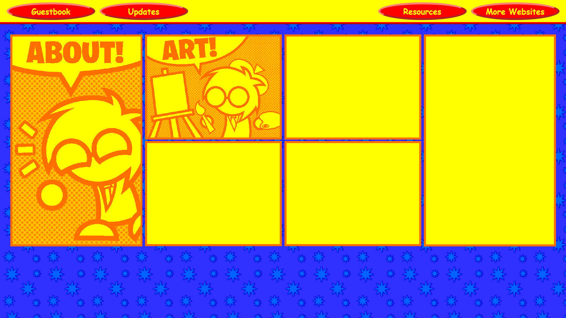
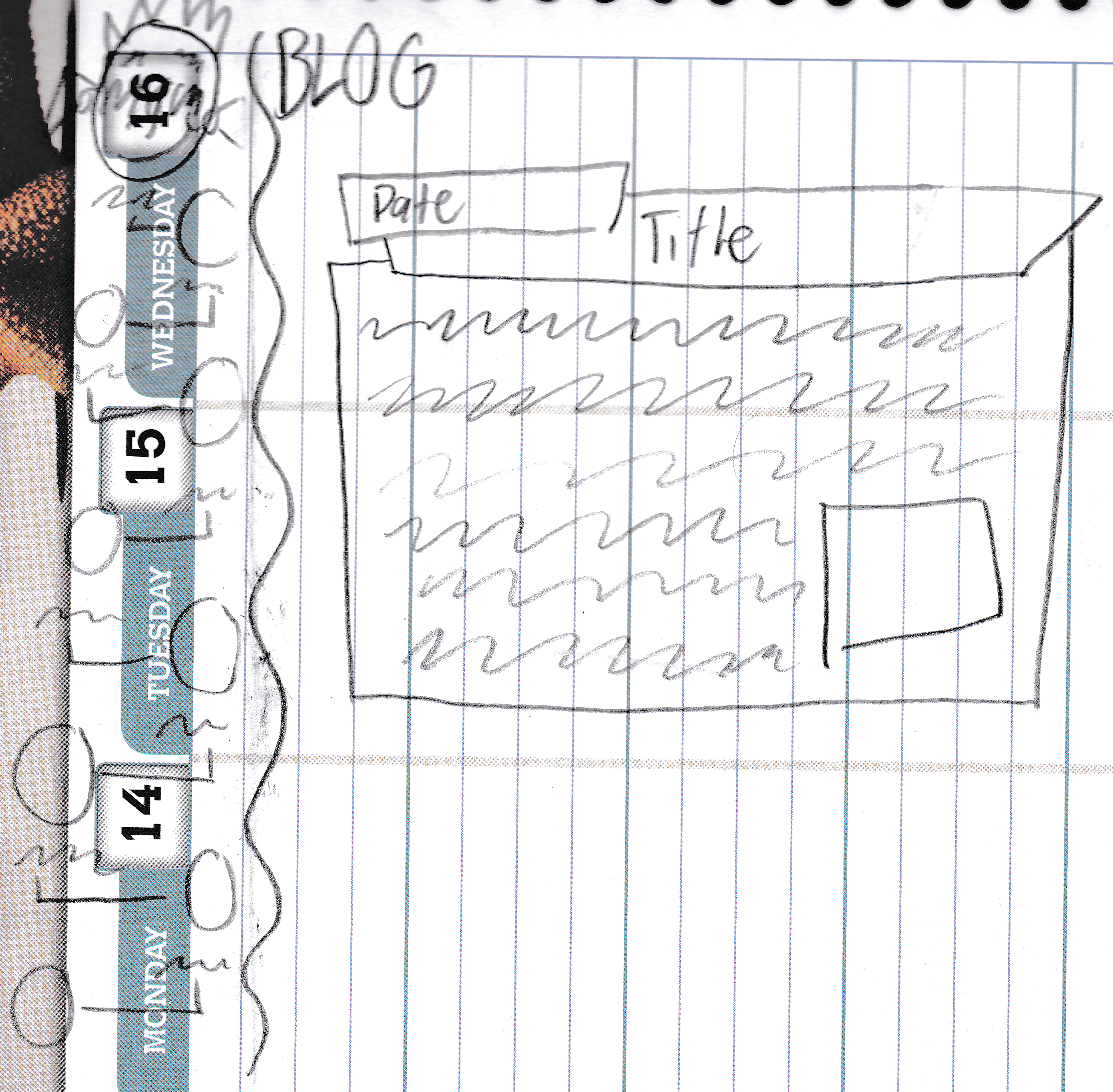
Here’s the most unique page of the theme: the blog page. The idea was that it would be like a notebook, where all of the posts are listed on the left and the actual posts are on the right. There was a spiral going down the middle, but it has since been deleted off of my file host.
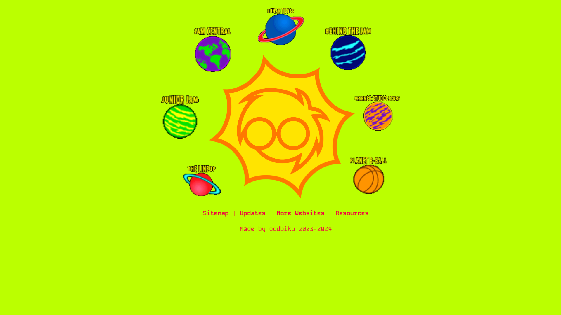
Planet Theme
Here comes the sun... and me moving away from the primary color scheme. This idea was that I was the sun with rotating rays and every page is a planet orbiting around me. As you can tell, each planet is from the 90s Space Jam website, but those were just placeholders until I drew the planets myself. Now, they will forever be placeholders because I never got around to drawing them. This one didn’t work out because space isn’t really my aesthetic. The index (shown below) was the only page that has been made for this theme. This wasthe start of trying to make the background color green because it's my favorite color and I wanted people to associate green with me.
Room Theme V1: Full Wall
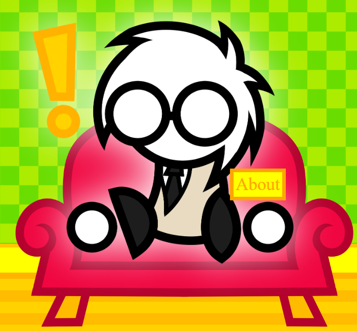
Here’s a theme that actually has distinct pages. The idea was you’re in my house and every object takes you to a page. An example of a good concept, but bad execution. I kept worrying about the color of the objects and I remember vigorously recoloring them and reapplying them. The current result still looks bad.
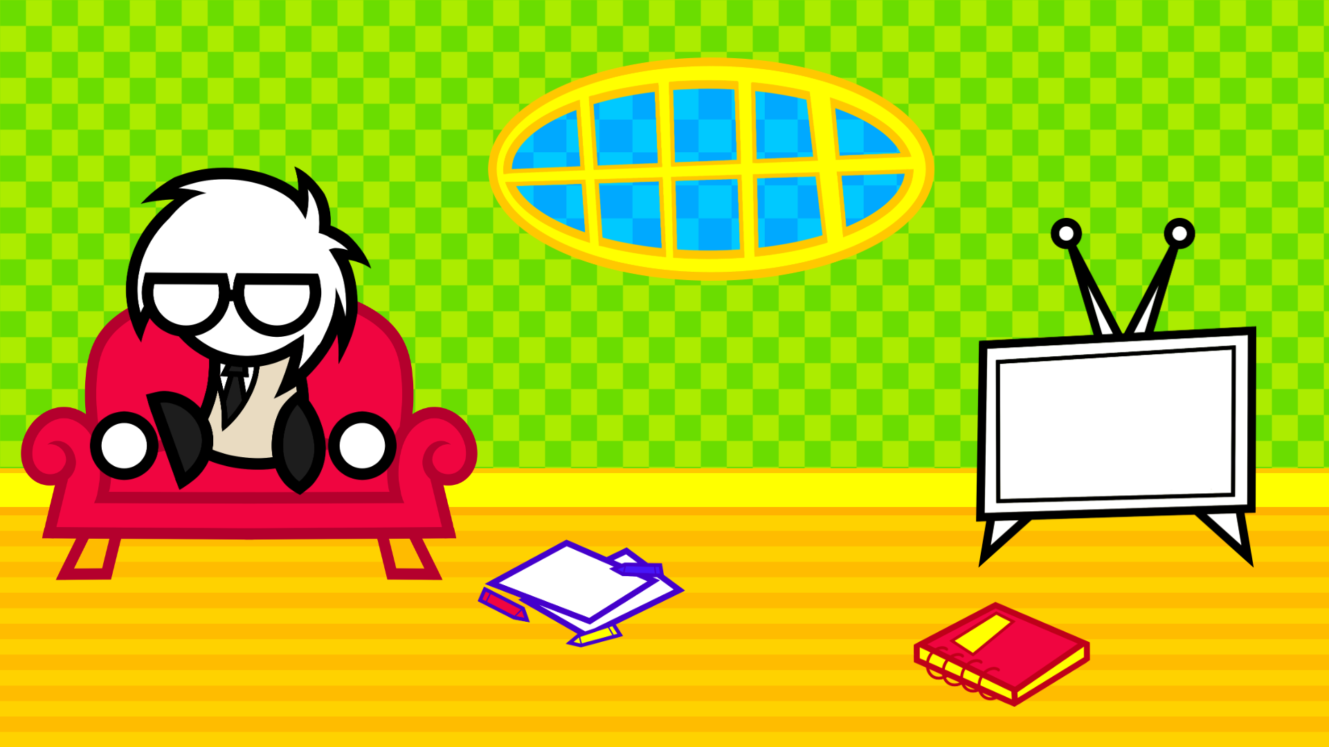
Here’s what each object represents:
- Me on the couch: About
- Crayons and paper on floor: Art
- Red spiral book: Guestbook
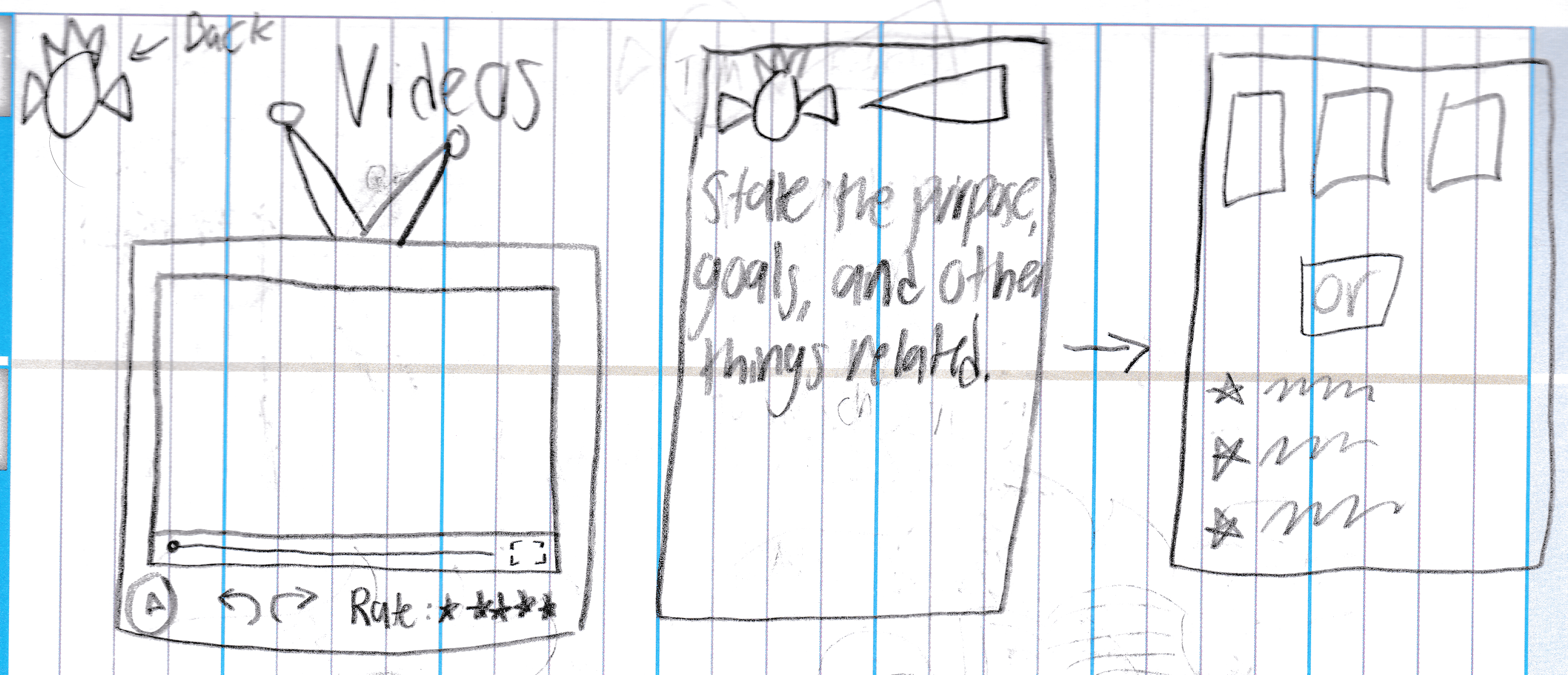
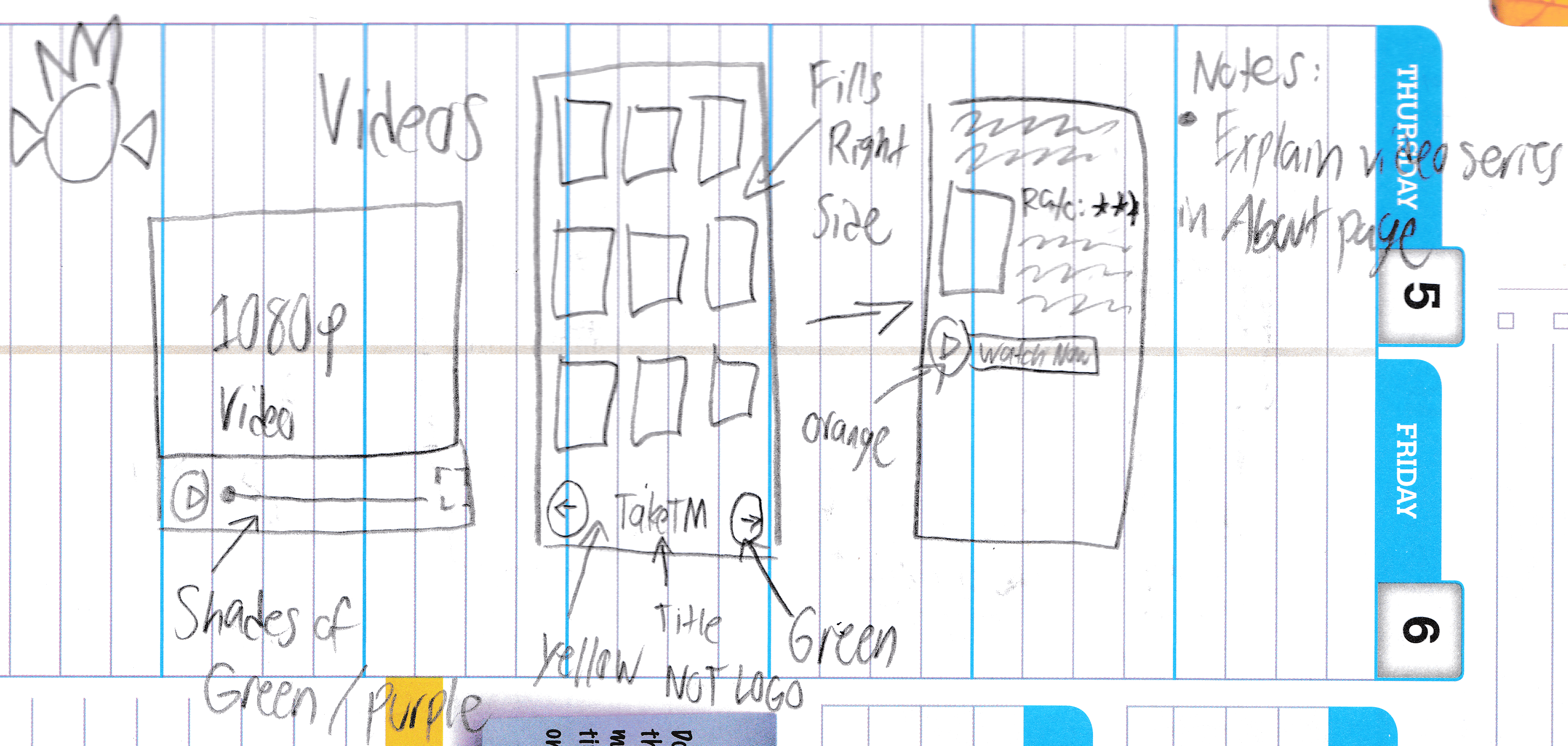
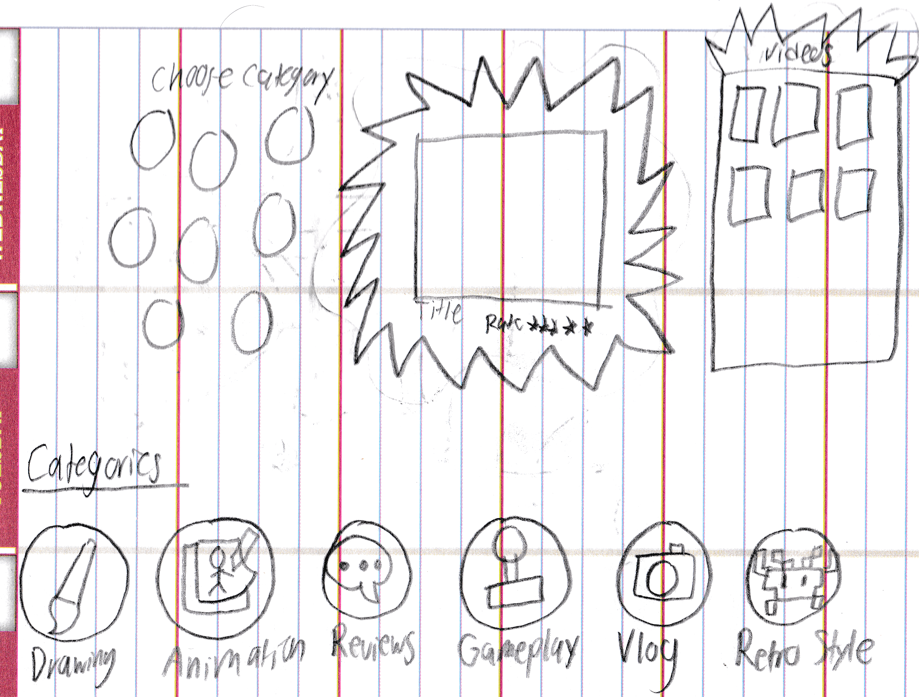
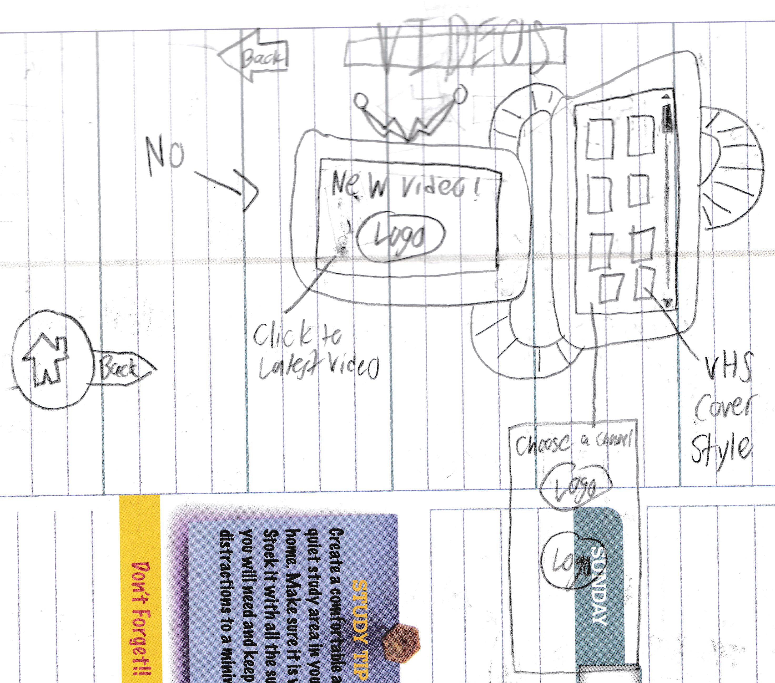
- TV: Videos
- Circular window: More Websites
Here’s what happens when you hover over me.
Here’s the art page, where it was represented by paper and crayons on the floor. It was supposed to be like papers on the floor, all jumbled and whatnot.
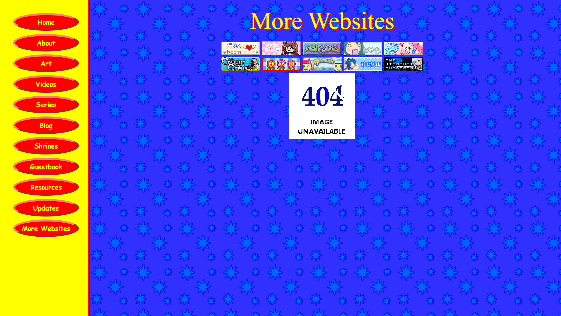
Here’s my favorite, albeit unfinished page: the More Websites page. The idea was that you click on the window and you go “outside” of my house and the grass shows you pages you can visit. The blank space in the sky was meant for a cloud to probably state some information about the page. The space on the grass was meant for a drawing of me doing some outside activity like jumping rope or blowing bubbles.
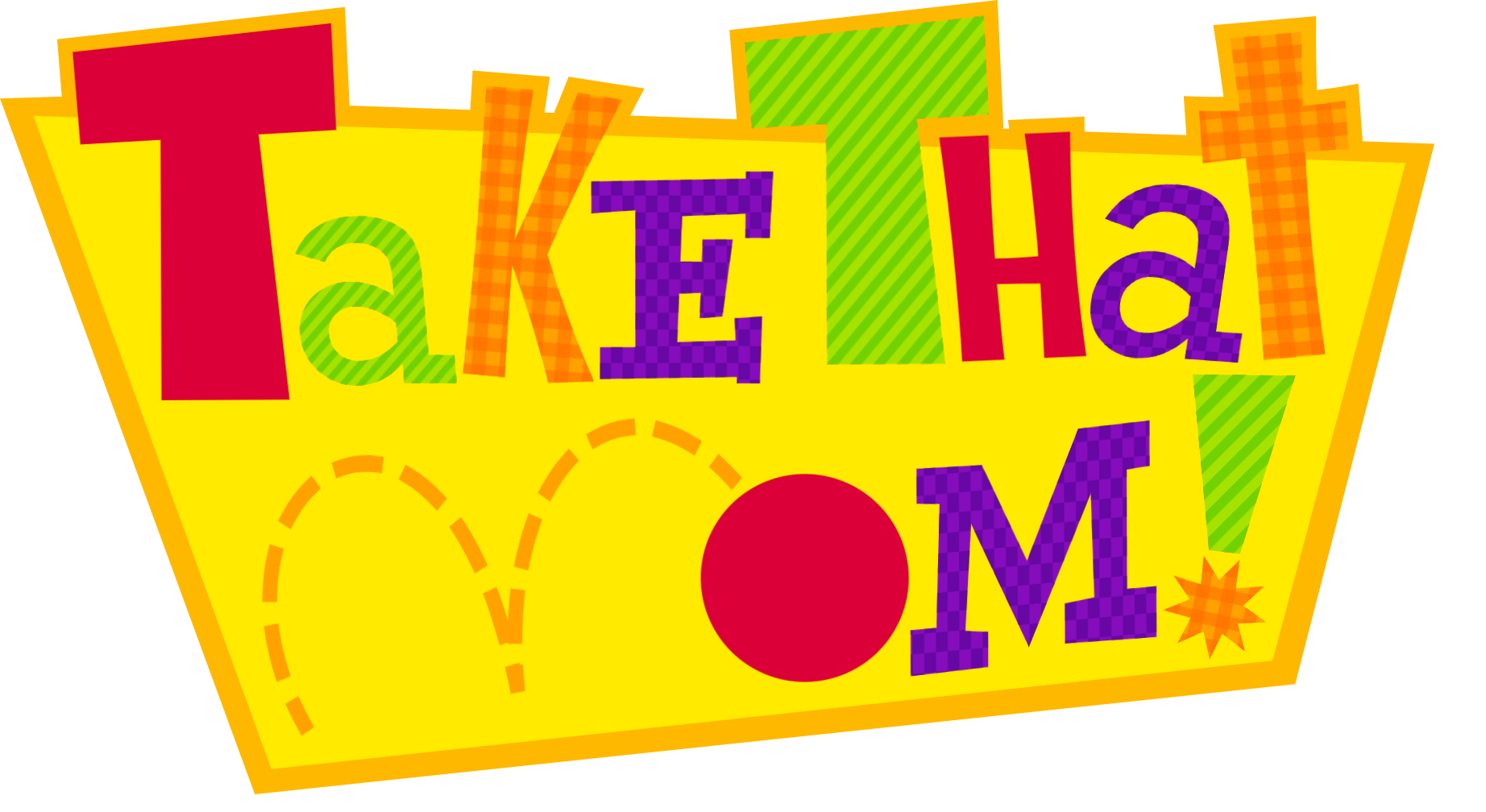
This was the start of the main theme of the website: the colorful kiddy theme, the theme that felt like me the most.
Room Theme V2: Depth
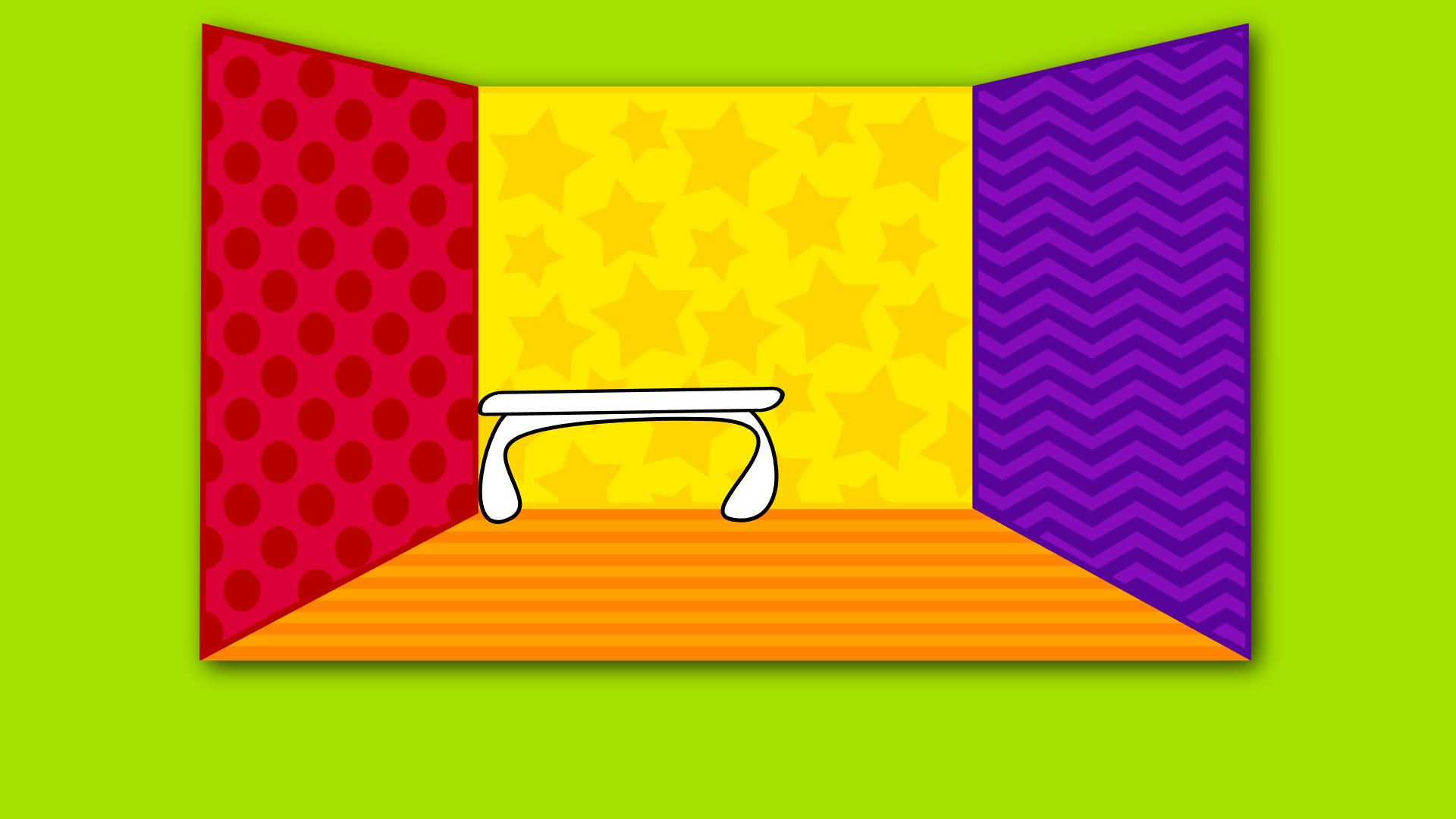
Another variation of the room theme. This time, with depth and multicolored walls. I had quite the ambitious vision here and it clearly didn’t work out for me because I didn’t like working with perspective. The only object that was even drawn was a desk, a nonclickable object. I could definitely reuse the star pattern for a future page.
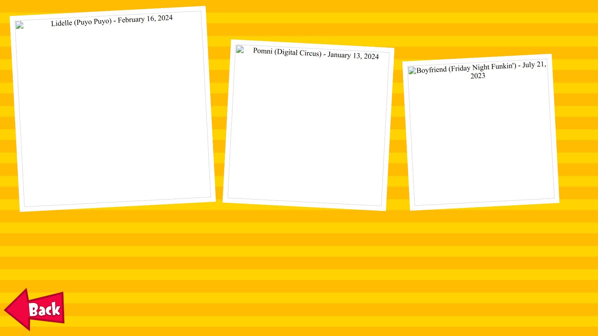
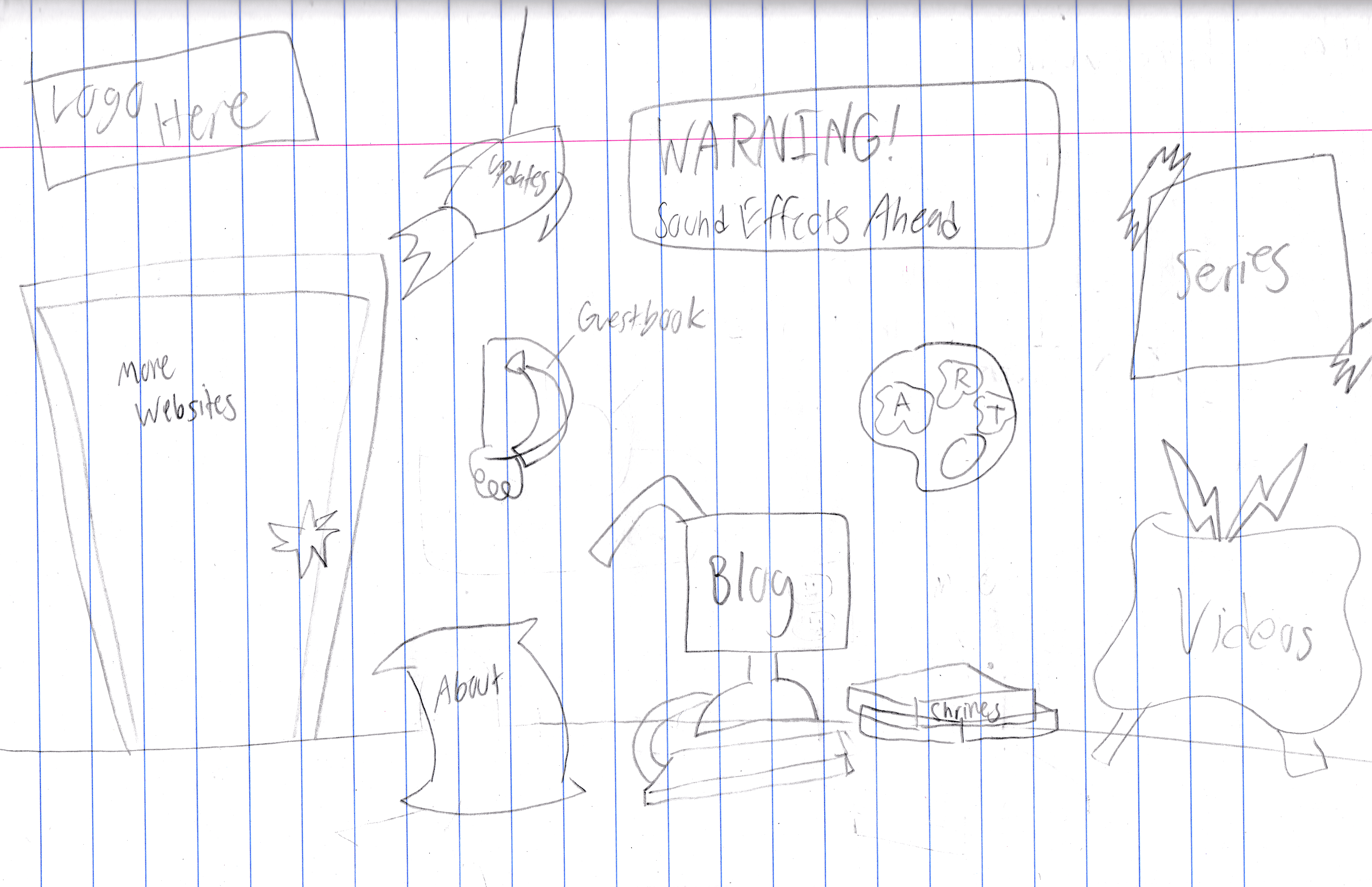
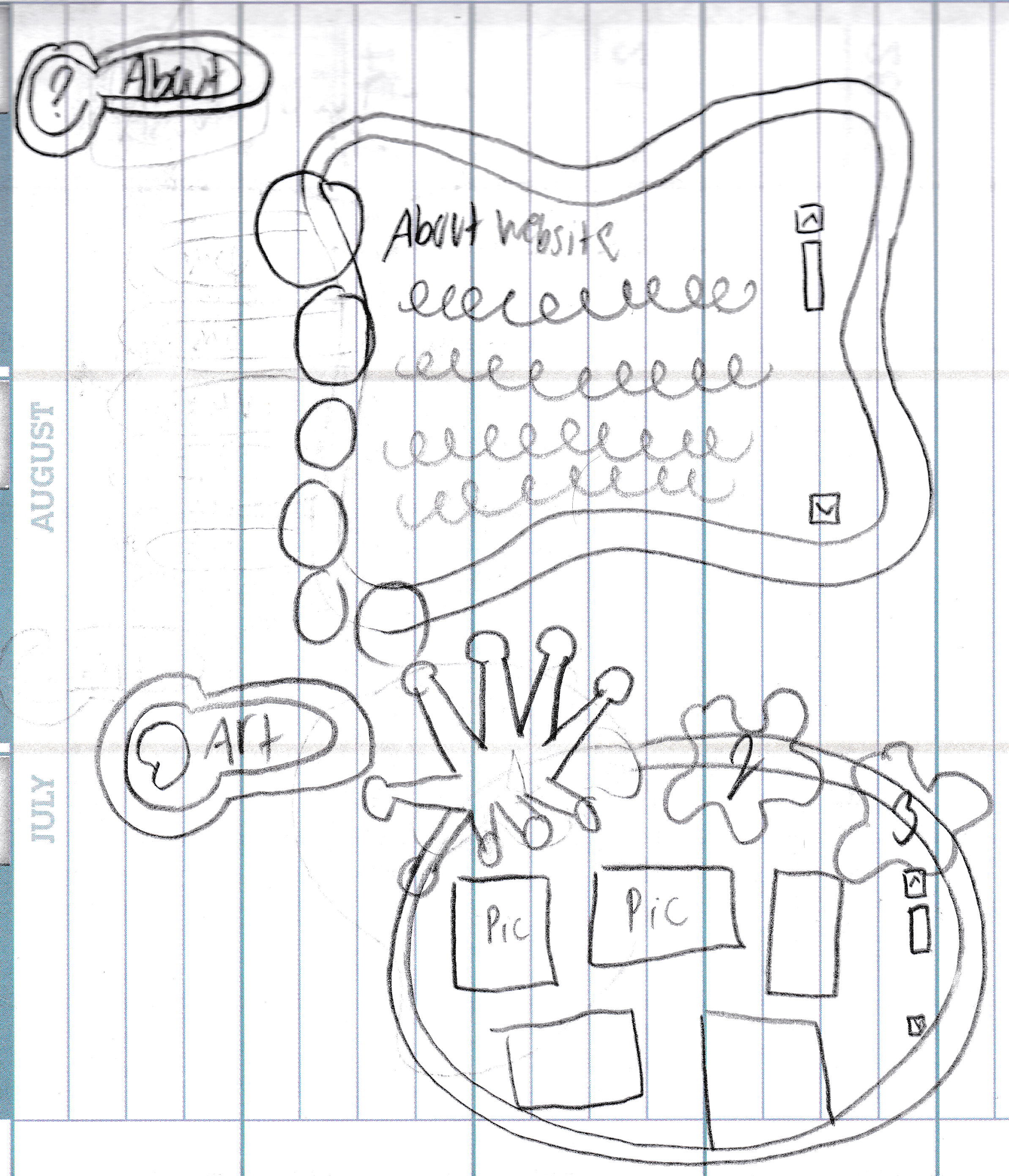
Room Theme V3: Full Wall 2
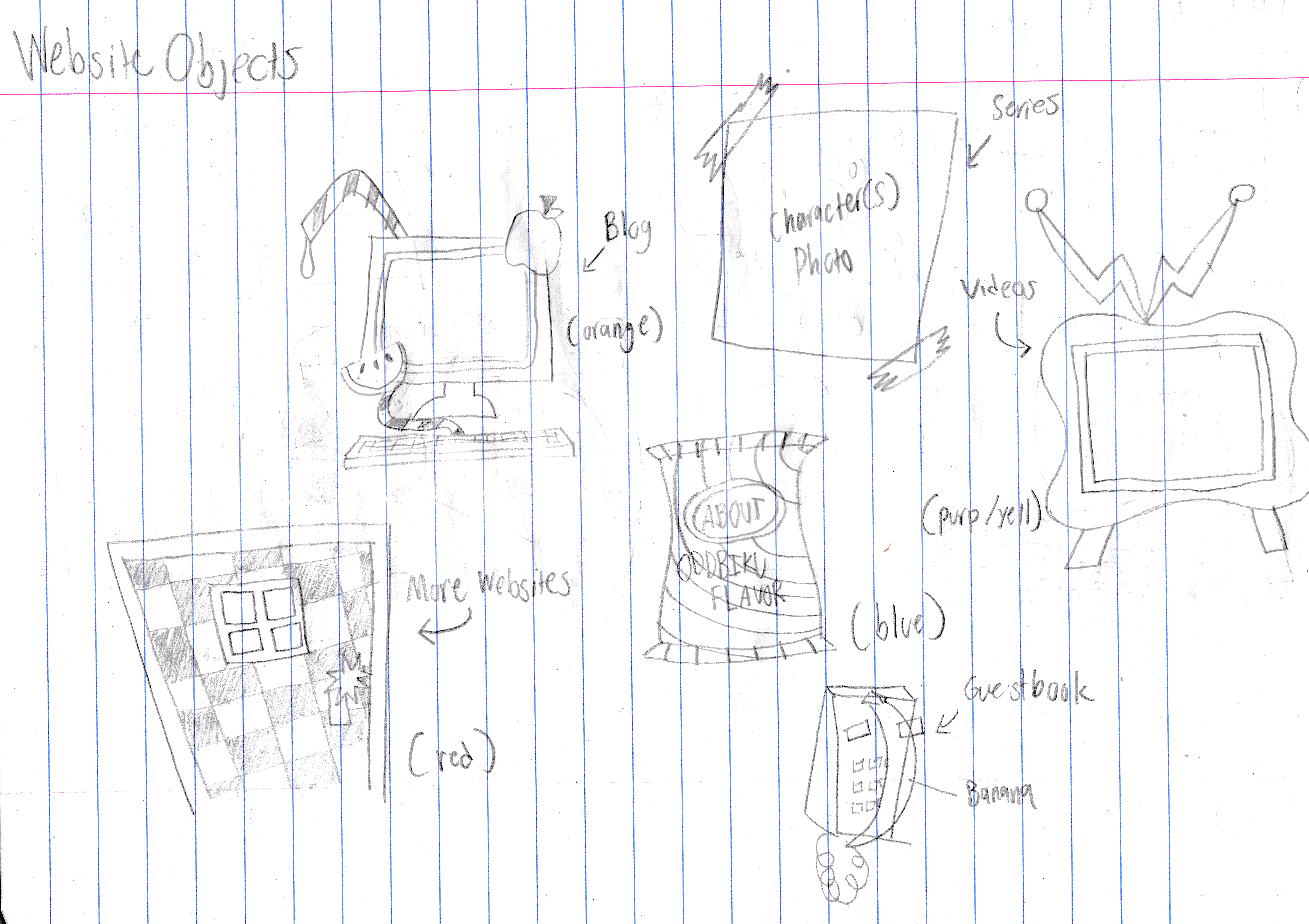
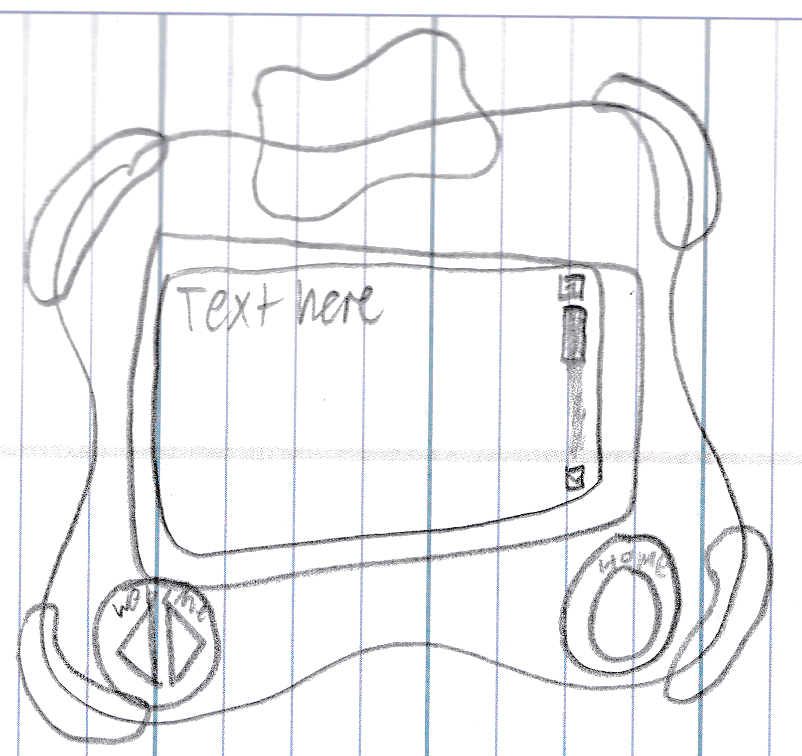
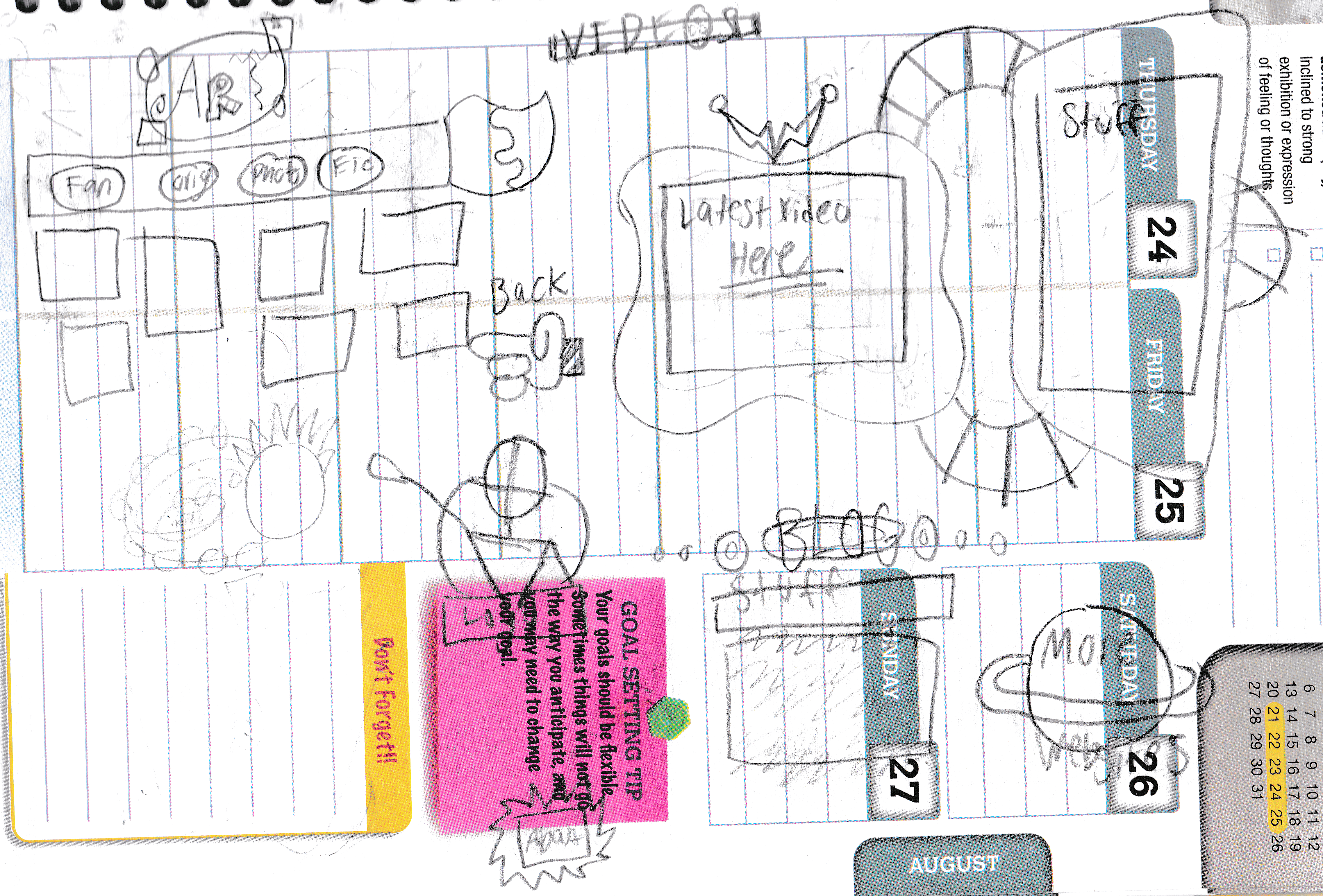
Here’s another attempt at doing the full wall room theme, except I am not drawn at all. I don’t have the file for this one anymore, but I do have an old work-in-progress screenshot of it. I also doodled each object in a notebook and these were the pages they were supposed to represent. Keep in mind that the colors shown are not the current colors:
- Red chip bag: About
- Purple banana phone: Guestbook
- Rocket: Updates
- Blue door: More Websites
- Paint palette: Art (reused for current art button)
- Green juice box PC: Blog
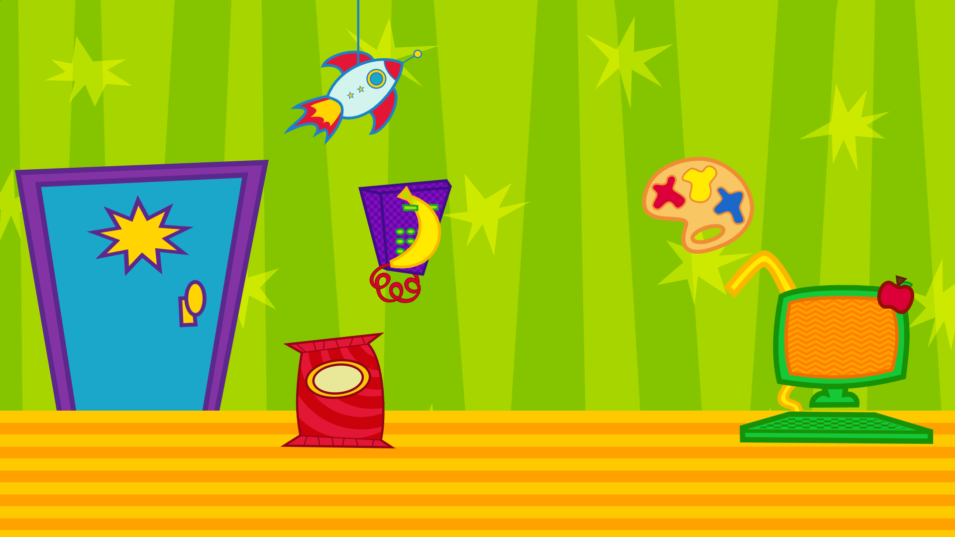
And three objects that only had a concept doodle:
- TV: Videos
- Pizza box: Shrines
- Poster featuring an OC: Series
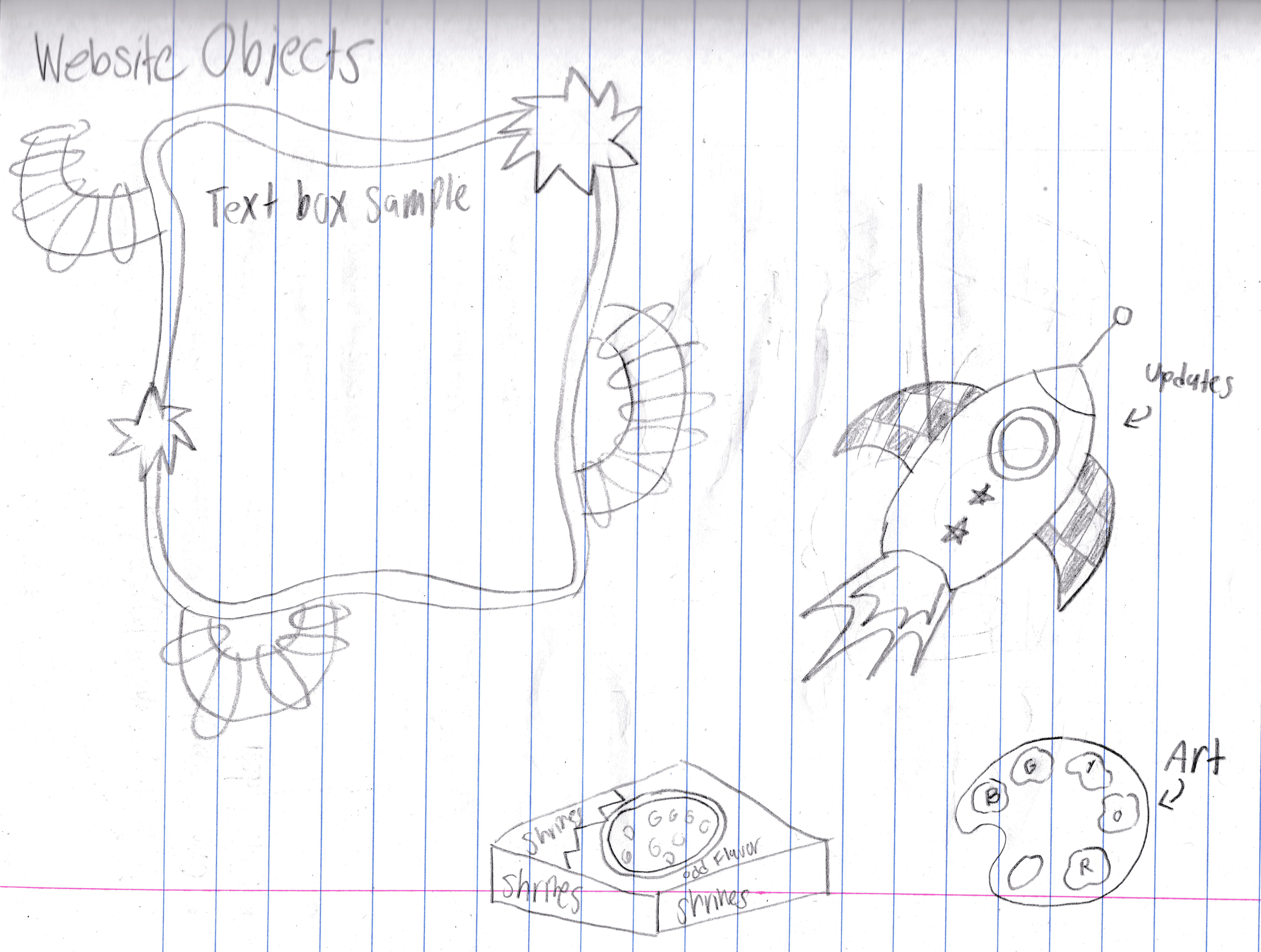
Here’s a concept doodle for what would’ve been the final layout.
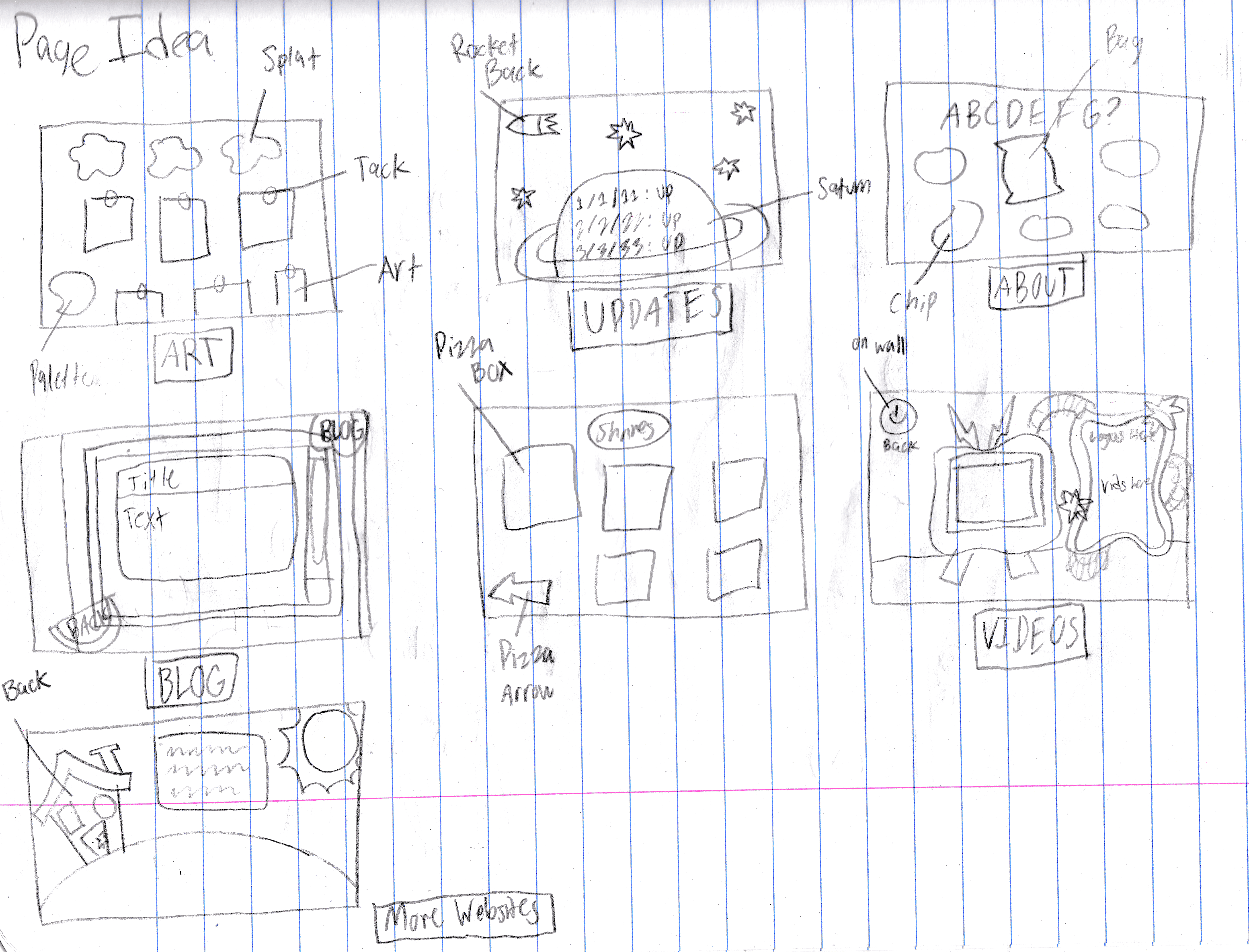
Here’s some concept doodles for each page’s layout.
Here’s two concept doodles of unused logos.
Here’s the digital versions of said unused logos. Only one of them was actually finished and one of them didn’t have a concept doodle at all.
This theme had some big potential. Very imaginative and playful. I’d love to revisit this one someday.
Beta Versions of Current Theme
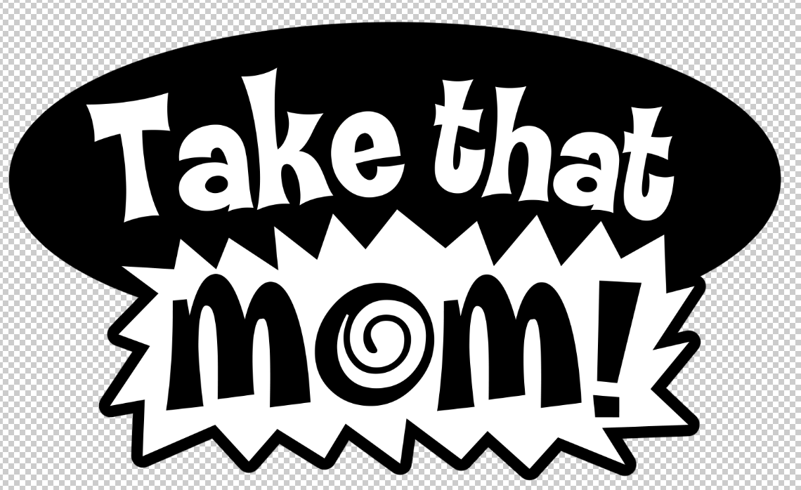
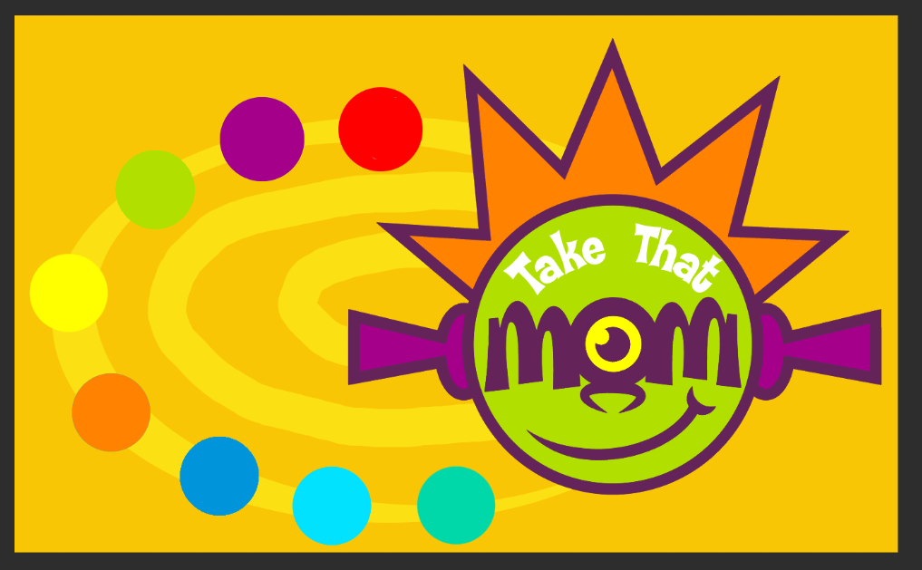
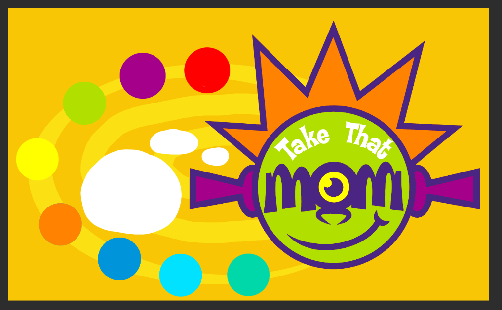
The current theme of TakeThatMom! (as of the writing of this blog post) took a lot of trial and error. The layout was inspired by Quisp.com in 2001. The logo was heavily inspired by the Noggin logo and is basically a bootleg version of it. Here’s the first concept doodle of the layout. Notice the lack of a series button and the addition of an update button.
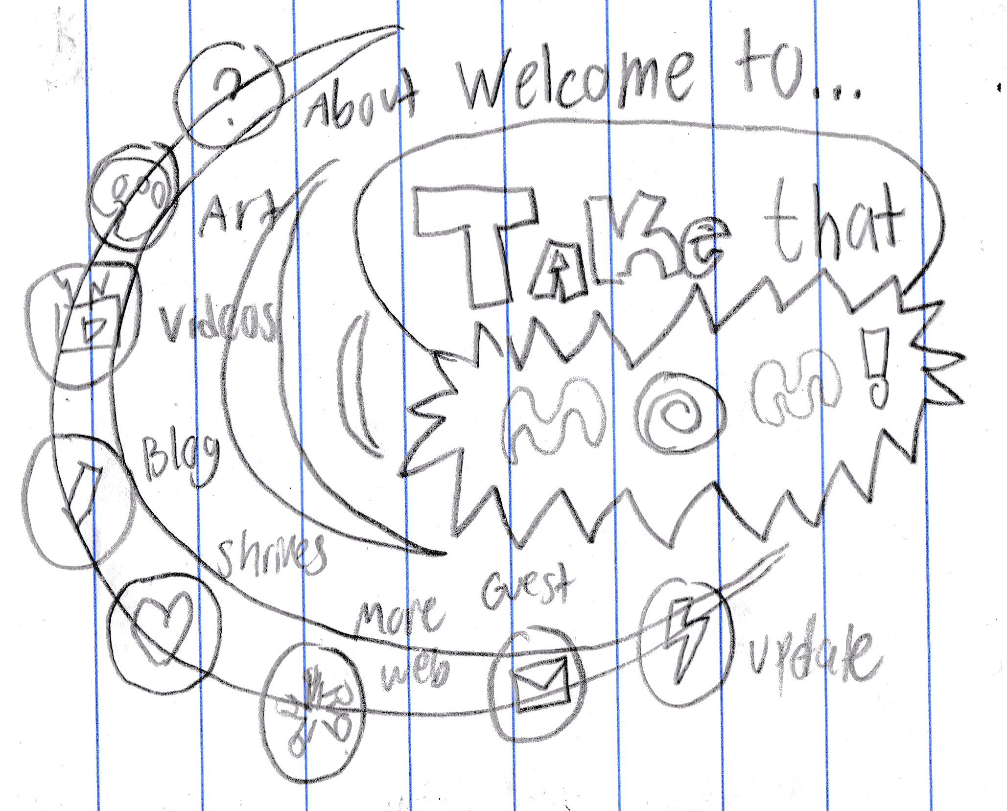
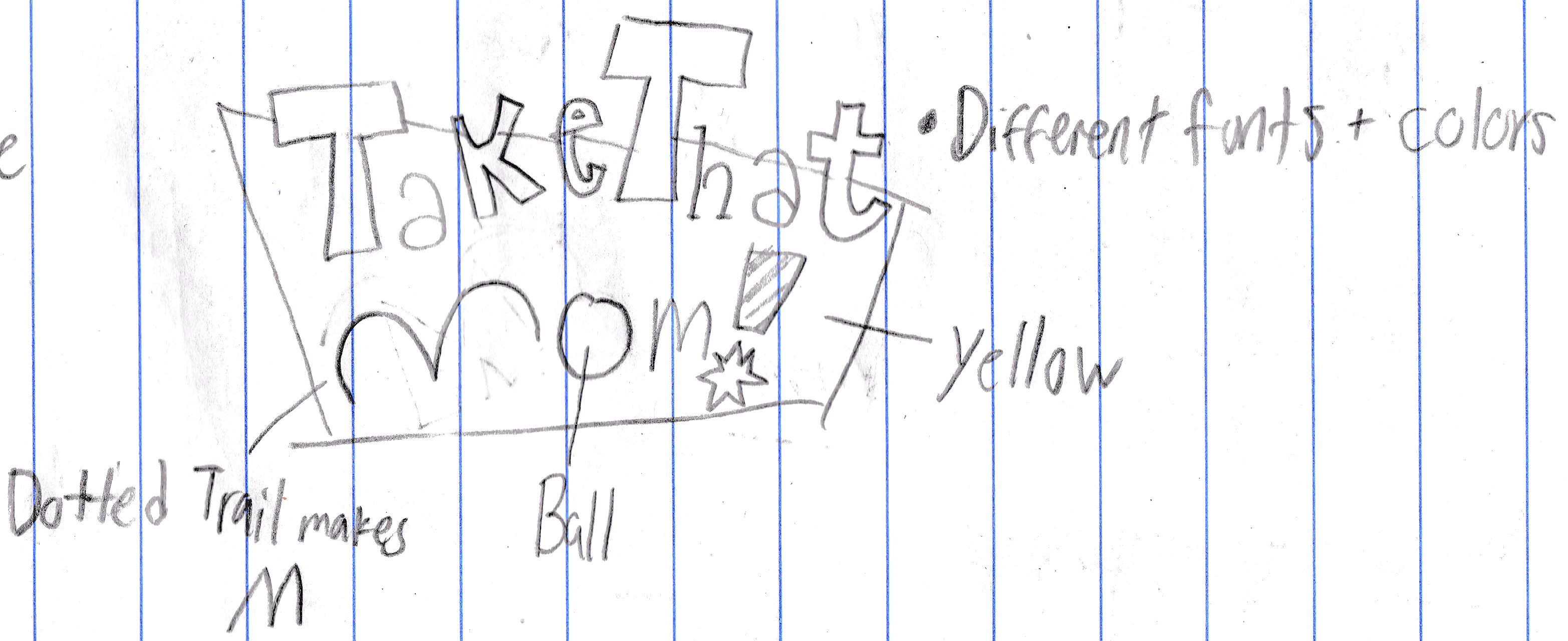
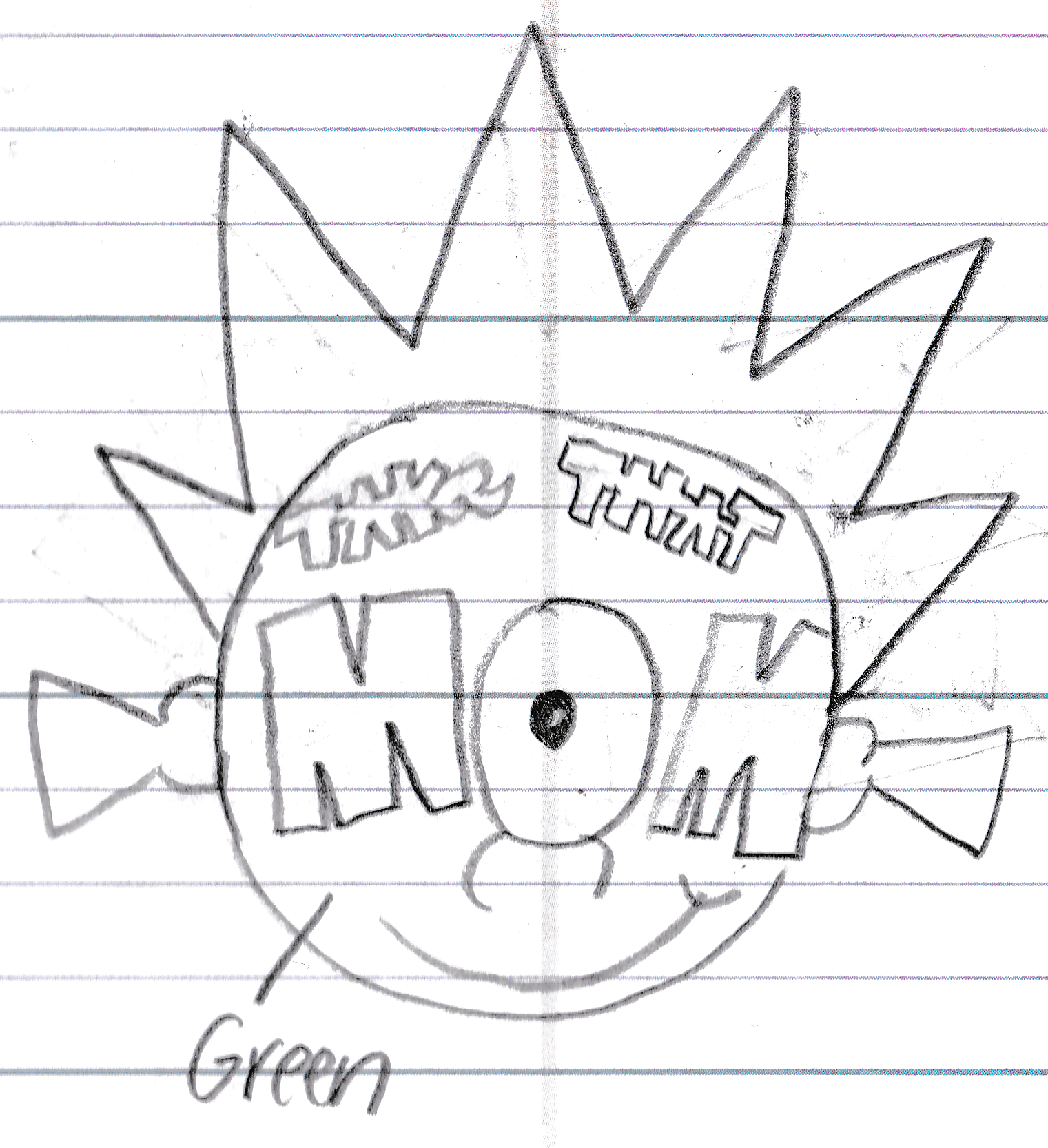
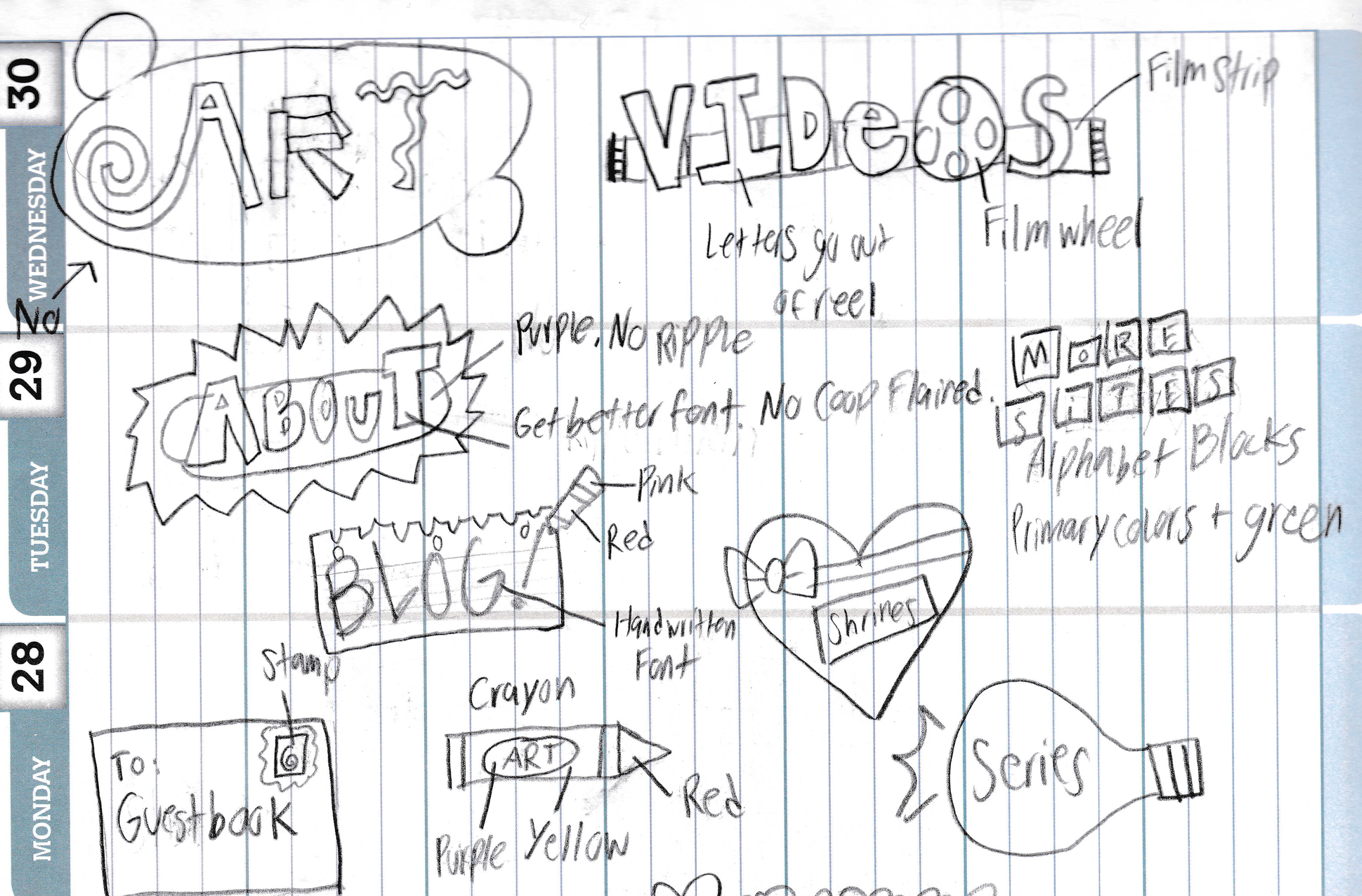
Here’s the concept doodle of the current logo, drawn in a school planner.
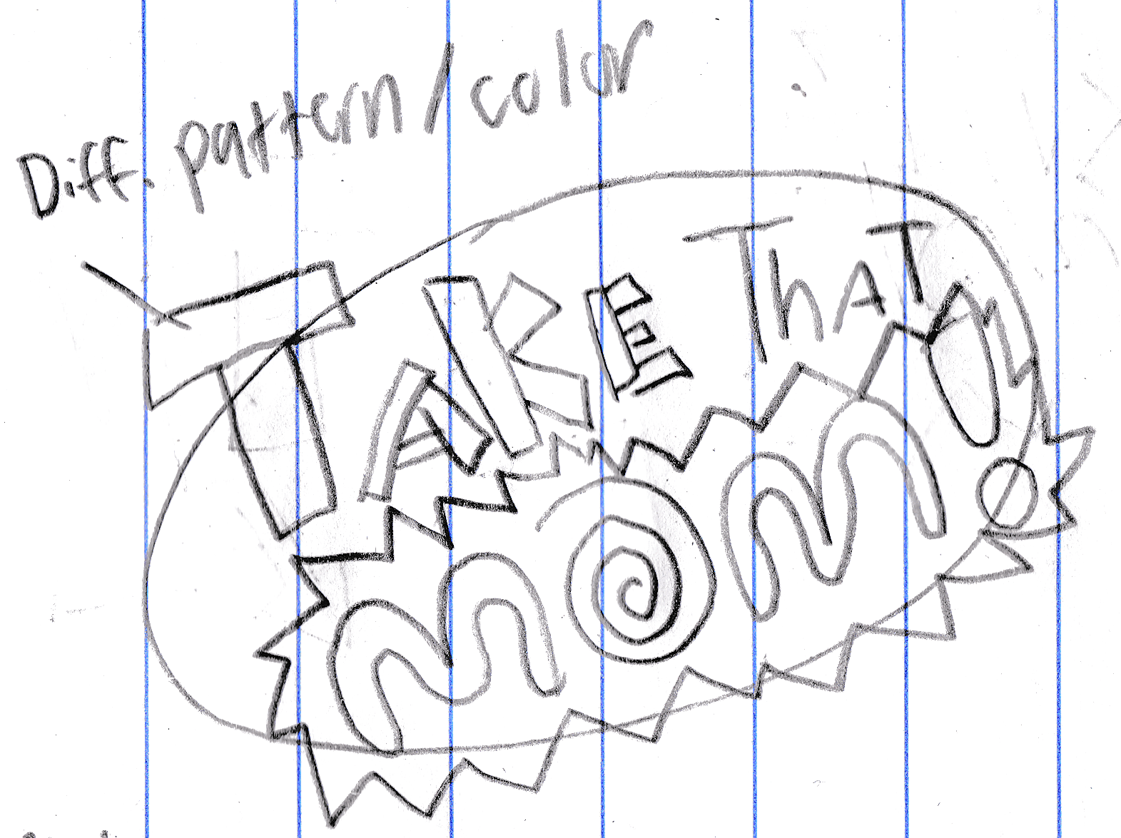
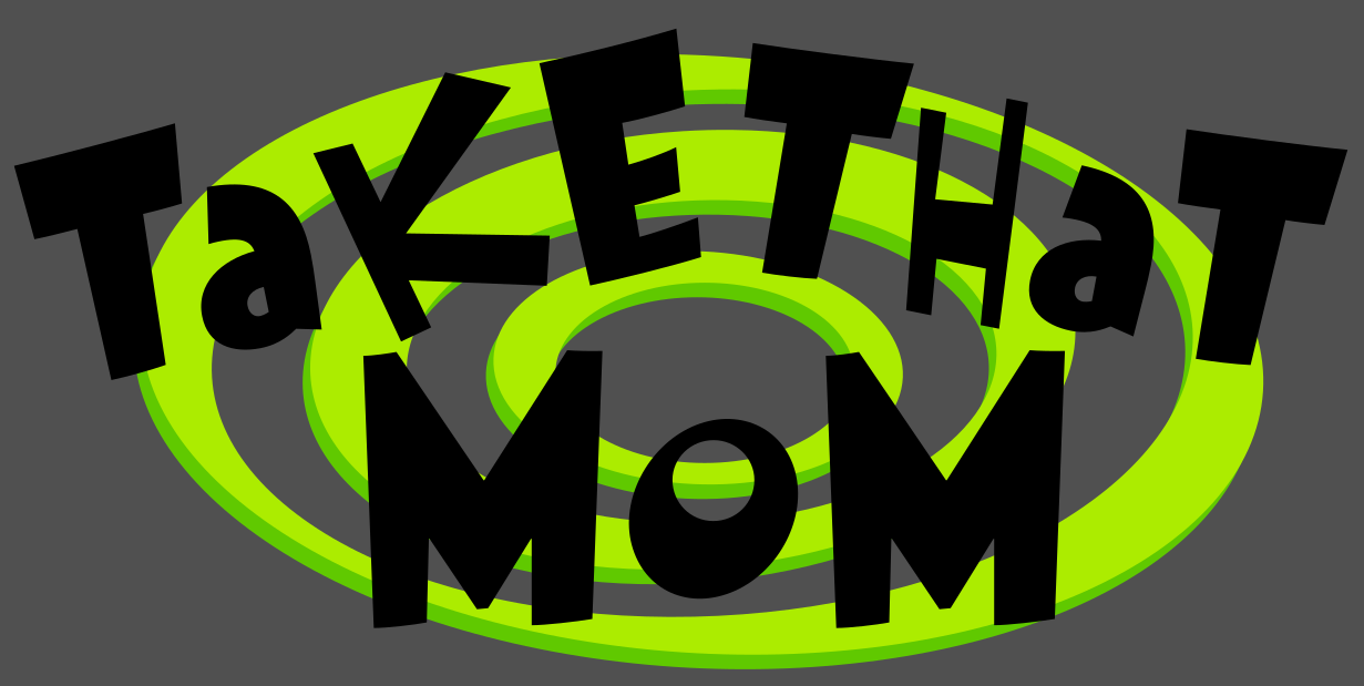
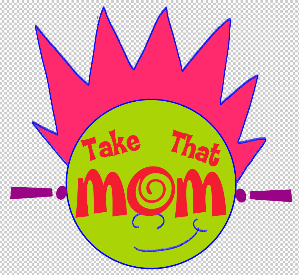
Here’s a forever work in progress beta version of the logo, drawn in Clip Studio Paint.
Here’s the very first web beta of the theme. The art button had a different icon and the fonts and colors of the logo were different.
Here’s the second beta of the theme, which was sloppily doodled on Clip Studio Paint.
A variation of the second beta that was sloppily doodled and recolored on ibisPaint X.
Originally, each page was going to have its own logo, but I scrapped it because I was a lazy fuck.
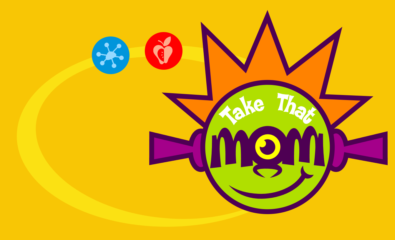
Here’s a screenshot where it looks very close to the current theme. Notice the blog button being a different icon and color. It took a lot of trial and error to get the current shade of green because the one I chose kept being too dark.
Here’s a bunch of other miscellaneous concept doodles. I don’t know where to put these.
There’s a lot of unused shrines and other miscellaneous pages too (could I make that a whole separate post?), but this post would be way too long and not get to the point: Why did the website reboot take so long? Life, lack of motivation, lack of ideas, and generally goofing off instead of working on this.
I titled this post “reboot” instead of redesign because I wanted to restart this website from scratch. The original version of the website didn’t have much to offer, certain pages just linked to another website (videos used to link to BitView, the blog used to link to DreamWidth), and the majority of its assets were borrowed from somewhere else. I wanted this new edition of the website to be wholly original and jam-packed with content. For now (ironically), there isn’t much content to look at and two of the main pages don’t have any content made at all, hence why you aren’t able to access them yet.
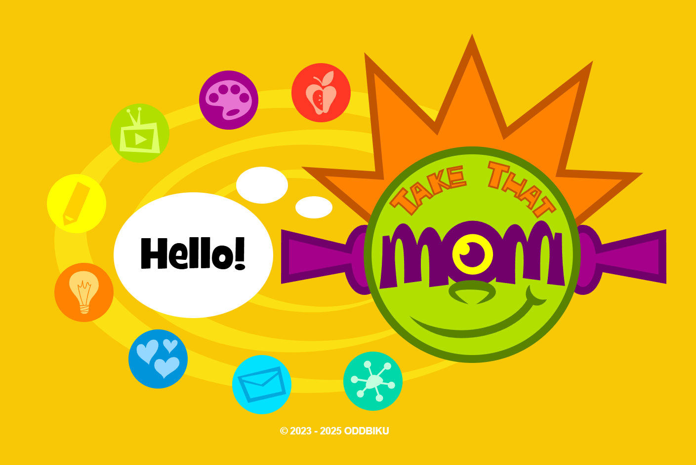
To my three fans who have been sticking around and stalking the website for updates for a whole year somehow, your wait is finally over. Welcome to the new TakeThatMom! Play along and new content will be coming your way.