

Clip Studio Paint, Photopea, Inkscape (shirt design)
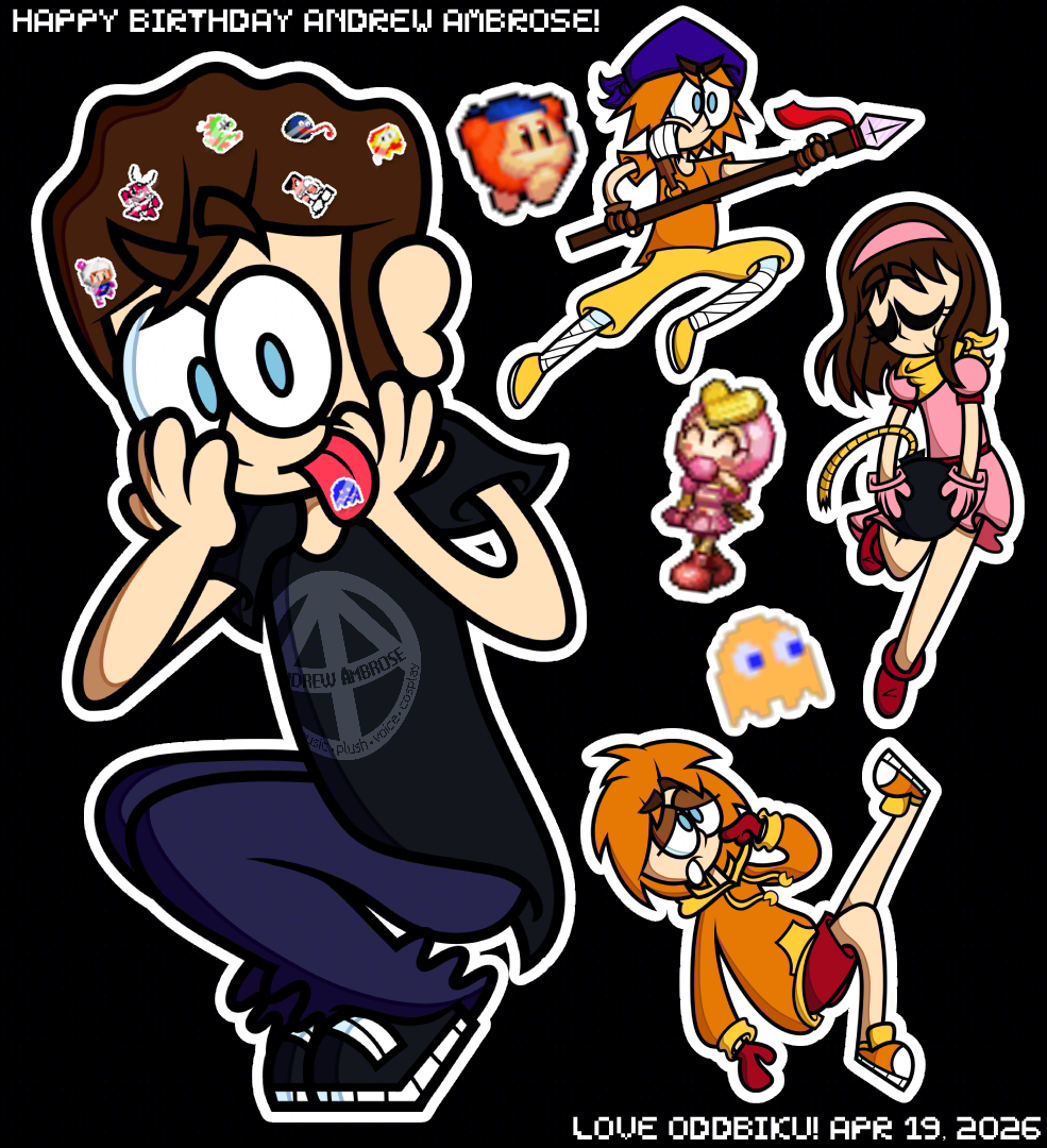
Birthday art for one of my homies, Andrew Ambrose (Click on his name to go to his YouTube channel!). On the right are him cosplaying some characters with their respective sprites next to them:Bandana Waddle Dee from Kirby, Pretty Bomber from Bomberman, and Clyde from Pac-Man. Happy Birthday Andrew Ambrose! 🥳Click on me to view his birthday message!
Ever since we reconnected after years of not saying much, you’ve been an absolute bro. Your positivity and confidence are infectious and lifts my mood every time. Every compliment you say genuinely means a lot to me and to this day, some still linger in my head.
Thank you so much for being one of the bestest friends I know. May this day and the rest of your days be as bright as you are. 🩵
From the bottom of my heart, Biku 💚
The idea was to make a regular drawing and use pixel art as decorative pieces, which I grabbed from The Spriters Resource. I had a way more ambitious idea for the design: a lot more pixel decor, some glitchy filters, and overall making it pop more, but due to time constraints and things not working out like I thought, I made it a lot more simple. Usually, I'd have a flashy background and the black was just a background color, but I felt like nothing I did really worked, so I left it as blank.
This is probably the very first time I drew a real person as they are. It was sort of a challenge because he didn't have a lot of illustrated depictions.The only real difference from his real life self is that I gave him bangs, which I copied from his Mii.
I wish I did way more with this one because I had a big idea in my head, but despite that, I'm just glad I made something for him to show my appreciation.
Clip Studio Paint, Photopea
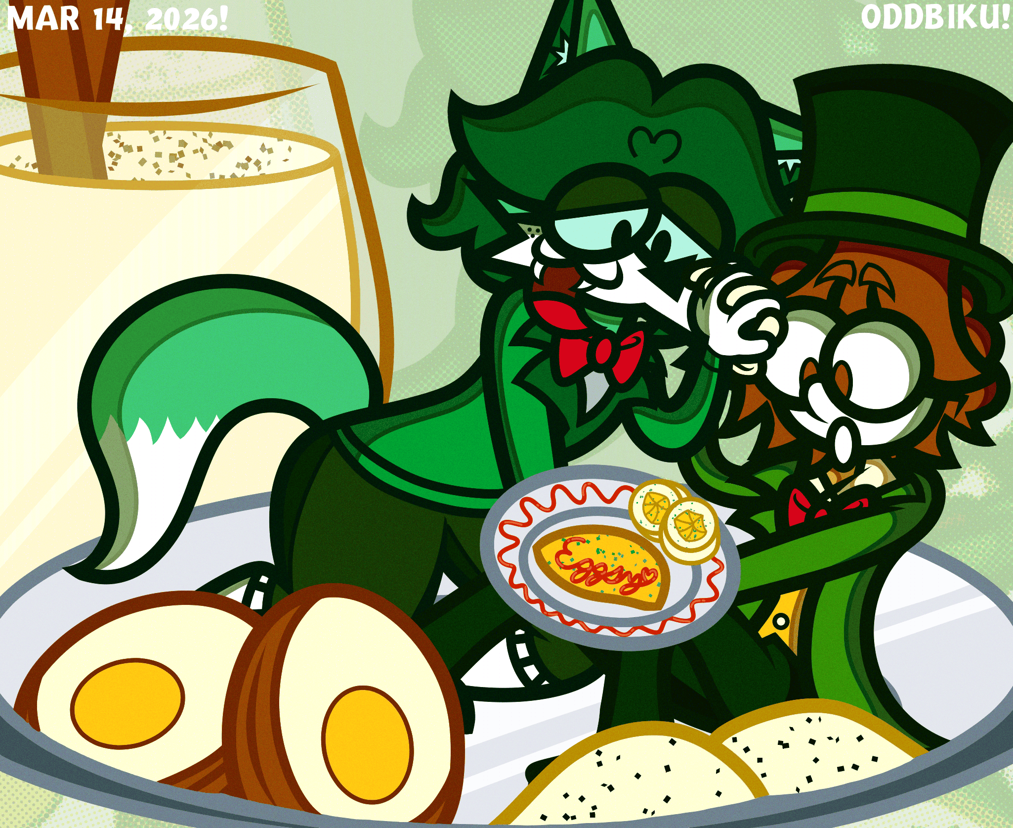
Art for Eggsy O. Benedict
I had a very ambitious vision for this one. Since his primary persona was an egg, I thought of drawing him surrounded with egg-centric foods, butdue to the amount of things I was drawing, I slowly lost motivation to properly polish it. However, since I promised to draw something for him, I lazily finished it. If I had more motivation, this would've been a lot better. At least I finally tried a few new things, like the shading style, composition, and drawing food. It's fine.
If you're wondering what foods are drawn, they are:
In the middle of the lineart, I realized I missed the opportunity to put eggs benedict (Eggsy's namesake) somewhere, but I was too far into it to add it.
Clip Studio Paint, Photopea, ntsc-rs
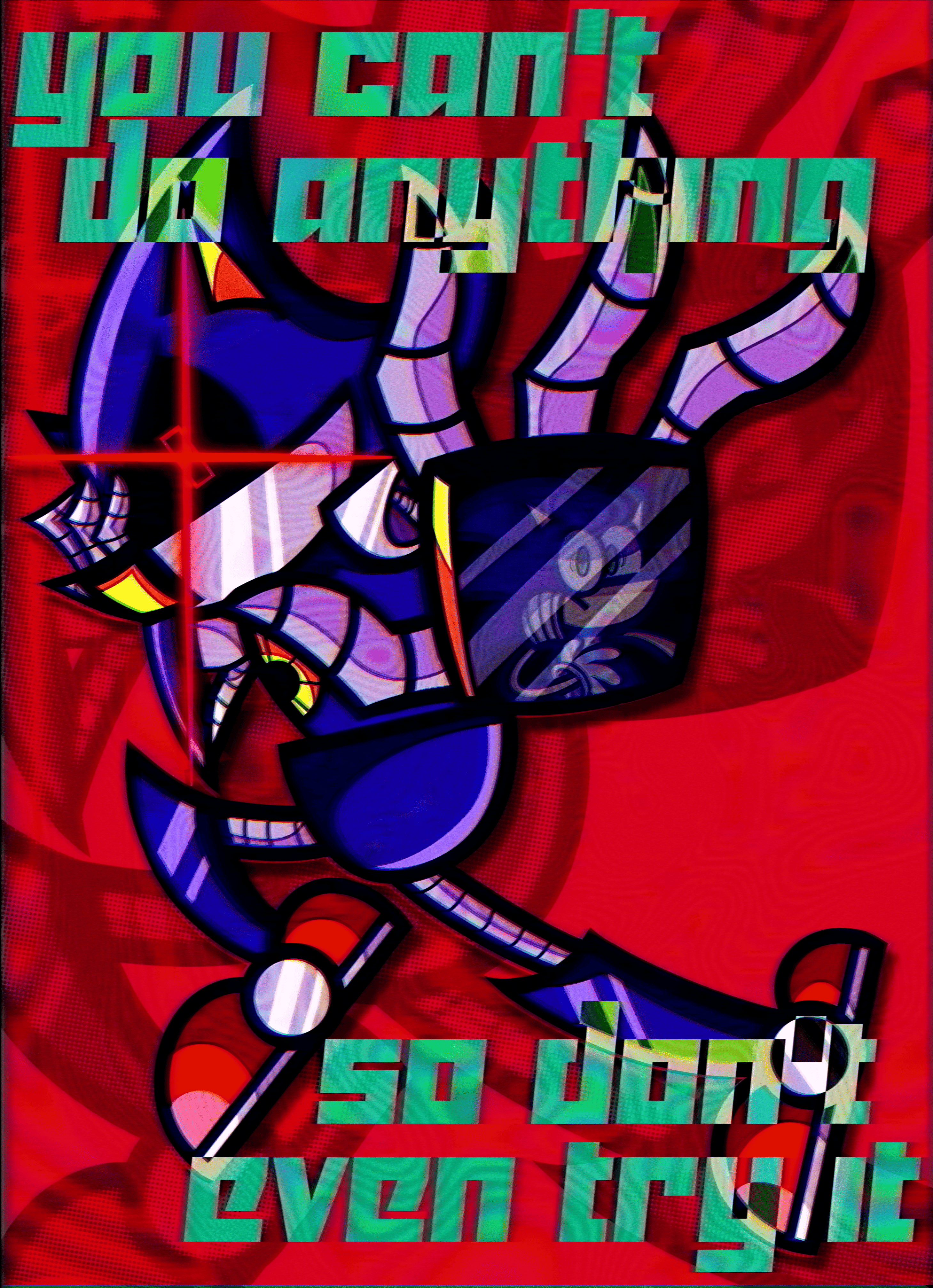
Fan art of Metal Sonic and Sonic the Hedgehog. The quote is from Metallic Madness "B" Mix.
Click me to watch the speedpaint!
I had this idea for a few weeks and I ended up experimenting on it. The intent with Metal's hand reaching to you and Sonic's being reflected on it was that it was an attempt to pull you into the artwork and that YOU are Sonic. I guess you're being threatened by Metal's awesomeness.
I saw this technique where an outline was drawn for the shadows and I thought it looked cool. I think doing that is way more impactful than just doing a basic lineless shadow, so I'll keep doing that. Though, I thinkthe lines should be a little thicker.
I also tried to incorporate a new program to my arsenal: ntsc-rs, a program that makes authentic VHS filters. I thought what I did on Photopea wasn't enough (the background was mostly an afterthought), so I just used that on a whim. It turned out okay. I feel like I used too many filters here, but I didn't want the artwork to be basic hard colors.
During drawing, I was going to add some sort of subtle spotlight-esque thingy, but I removed it because I wanted the art to be more vibrant, but looking back, I should've included it. I feel like the font I chose was a little too basic and that the arrangement of the text overlapped too much with the artwork.
Clip Studio Paint, Photopea
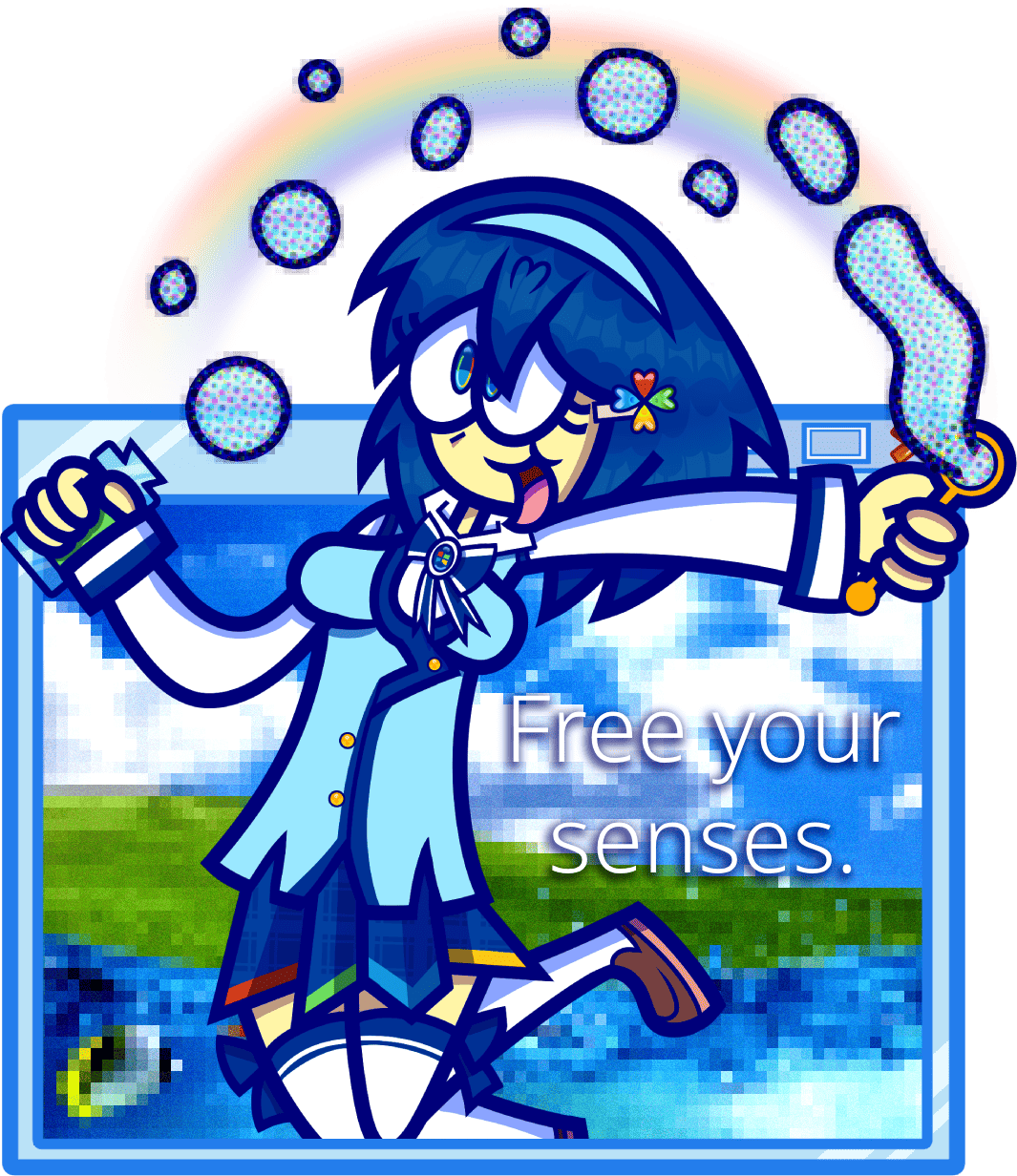
Fan art of Madobe Nanami, the Japanese Windows 7 mascot, with a Frutiger Aero theme.
Click me to watch the speedpaint!
Probably the first artwork where I actually planned out what I wanted to do. Not thoroughly, but the basic gist. I was so focused on drawing the characterthat I didn't think about the background very much. I was somewhat hesitant to make it transparent, but I gave up and just did that. The phrase"Free your senses" doesn't mean anything. It just sounded airy and free, which was the intended vibe of the work.
I feel like I could've done way better with this one, such as using the Shading Assist tool as a guide instead of winging it myself (I do like the hair shine, though), not making the drawing so blue, actually drawing a background instead of hastily drawing a crappy window and adding random PNGs with the worst choice of filters, I REALLY don't like how I added a mosaic and a color halftone filter to the bubbles because it looks pretty ugly. At least I did an action pose instead of a standing or waist up one.
Clip Studio Paint (drawing), Inkscape (logos), Photopea (final editing), Paper and pencil (rough sketch, does that count?)
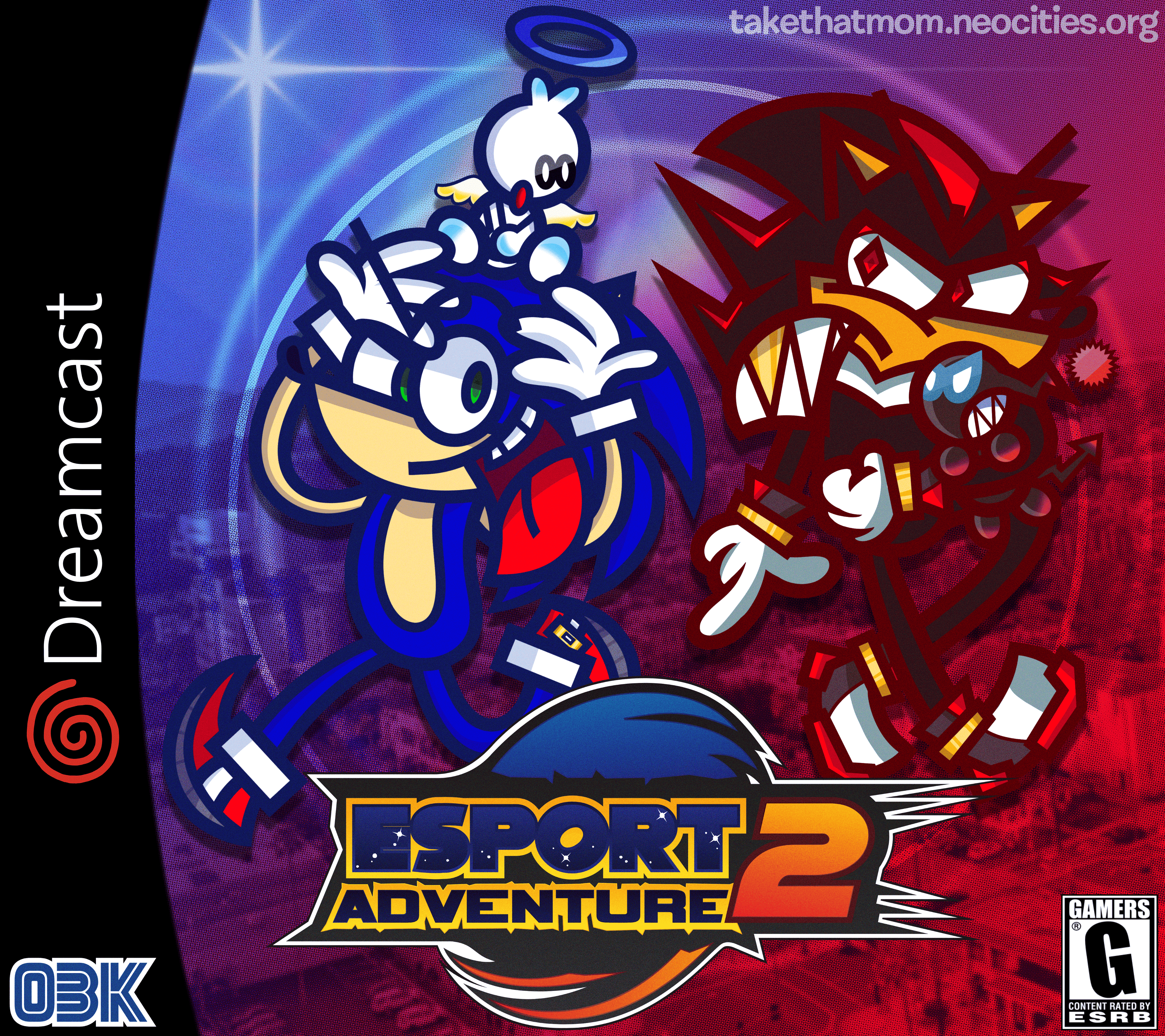
Sonic Adventure 2 fan art despite me never playing the game.
This was drawn for a local esports team's video game fan art contest. The contest was for middle and high school students and I entered as a senior high schooler. From start to finish, it took 8 days to complete. I completed this months before the finalists were announced, so for weeks, I was panicking that I wouldn't win.
I didn't win, but I was a finalist (judges favorites!). As a result of being a finalist, I got my art printed on a slab of foam or something. I think it was because I bribed the judges through the art by putting references to the city it was hosted in and esports. The background is actually a photo of the city.
What you're looking at is actually a censored version of the artwork, as the uncensored version namedrops the actual city and the host of the contest.
There are a few issues with the work, such as the shading, confusing character silhouette, and the fact that I forgot to draw SOAP shoes, but other than those, it's great.
This is what happens when you actually take time with art.
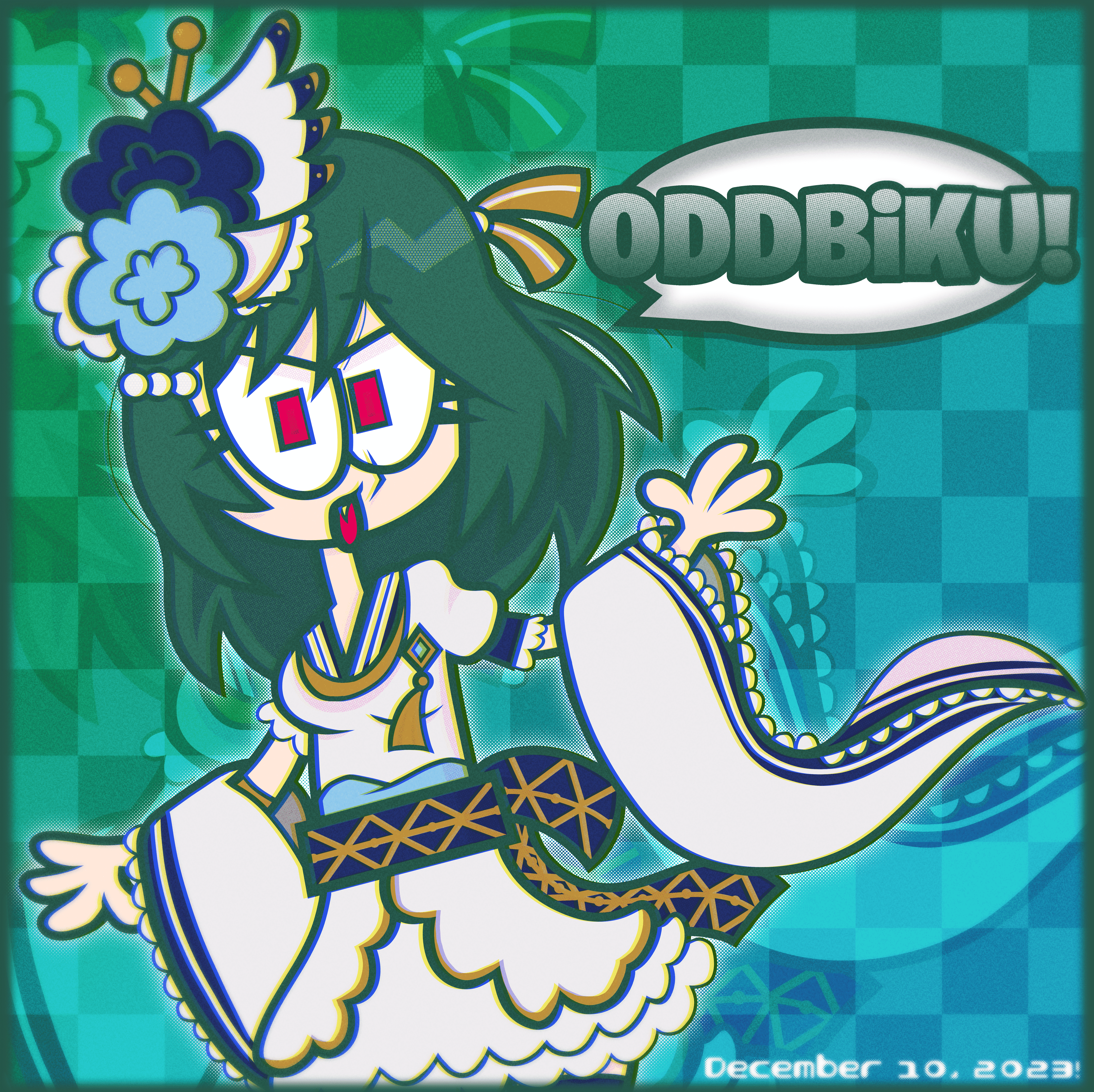
Clip Studio Paint, Photopea
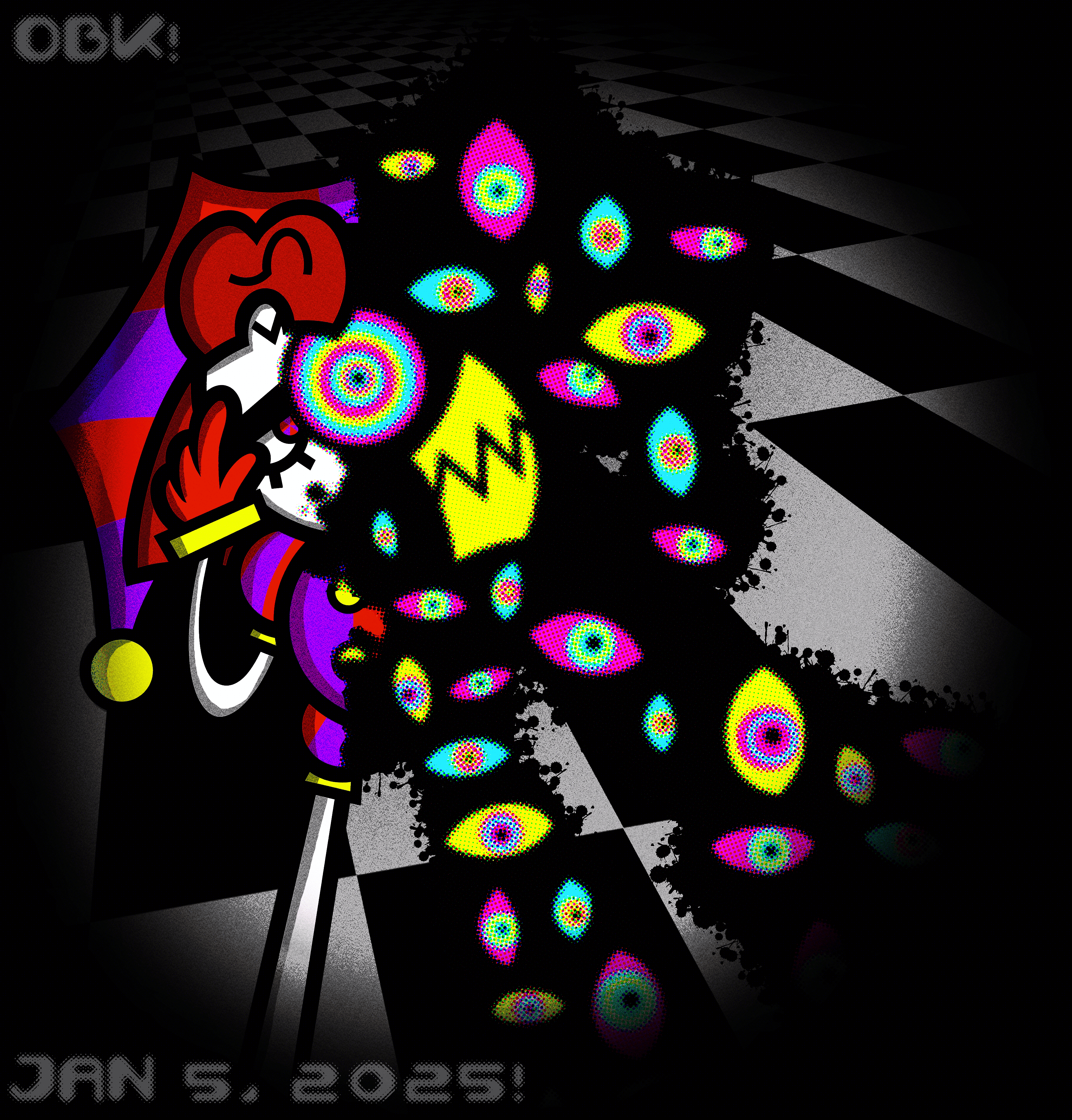
My first time using Photopea and the third Pomni art I made.
I really liked those "abstracted Pomni" concepts, so I tried to do my own. Another rushed drawing = BAD. I tried to do a perspective, but I didn't even follow my sketch. It was supposed to be a worm's eye view where Pomni is looking at you and reaching her hand out, but it doesn't look anything like that here. Not to mention the background is awful. I just skewed a checkerboard pattern and was done with it. The only savior of this one is the abstracted eyes and the color halftone filter on them. Other than those, this is just awful.
Clip Studio Paint
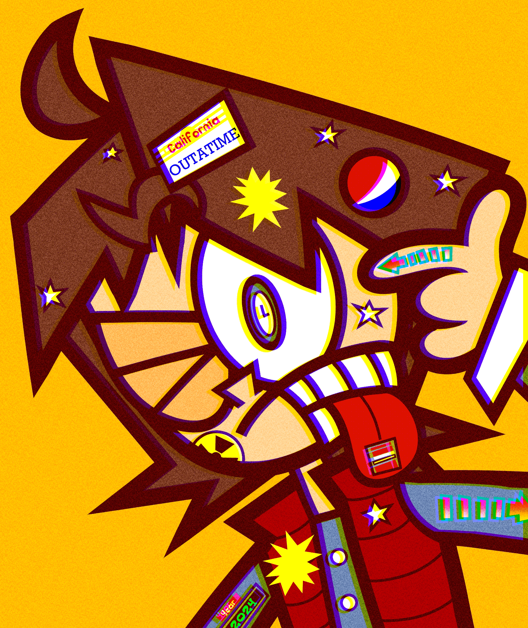
Back to the Future fan art of Marty McFly for Back to the Future Day. Such a good concept wasted to bad execution.
The concept was inspired by Mika Pikazo, where there'd be a bunch of stuff on the character. For this one, I tried to draw some iconic Back to the Future imagery, like the arrows on his arm and finger, the time circuit on his other arm, the sports almanac on his tongue, and the DeLorean's license plate on his hair... and a Pepsi logo because the films seem to really like that. This one was rushed and it sucks because of that. The chromatic abberation effect is kinda stupid here. The only good thing about this is his design and expression.
Clip Studio Paint
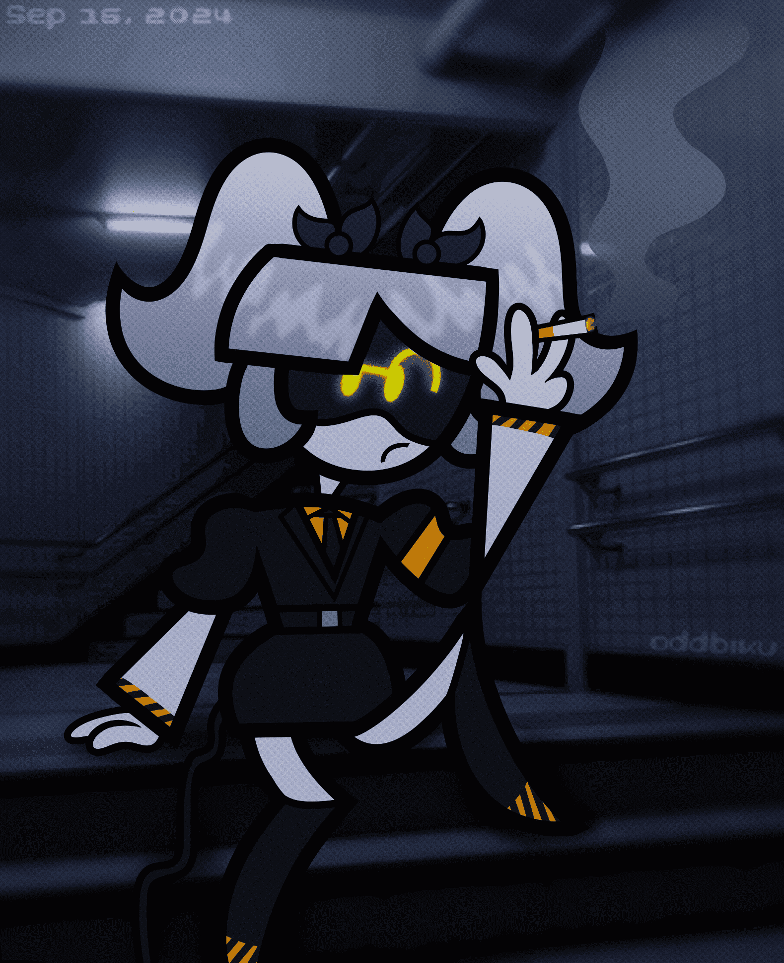
Fan art of Serial Designation J from Murder Drones.
I tried to put an illustrated character onto an IRL background. It's not done very well, though I think her tail flowing down the stairs is good. The design I gave her isn't good either. I think I followed the glow effect on her eyes from a Pinterest tutorial? I don't remember how I did her hair shine, but I remember doing it like spikes and then doing some kind of blur or distortion effect.
Clip Studio Paint
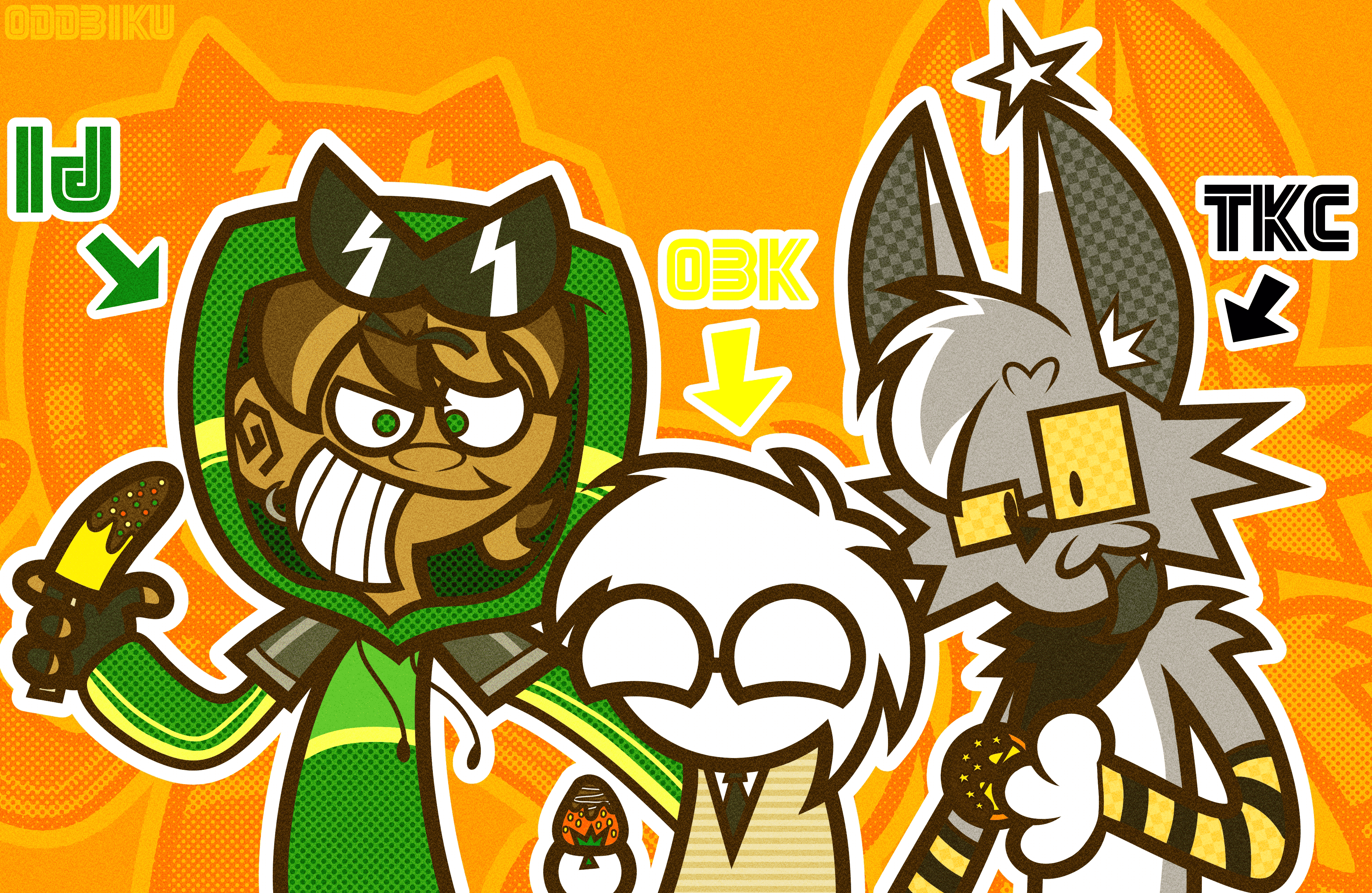
Me and two other pals have the same birth month of August, so I drew something for all of us. On the left is IJDZ and on the right is Trickycharm.
For some reason, I chose to make the theme chocolate covered fruit. IJ gets a banana because his character is a monkey, I got a strawberry because that's my favorite fruit, and Tricky gets an orange slice because, at the time, he was into Dayshift at Freddy's and Jack Kennedy is orange. I really liked drawing their characters and how I gave each of us a pattern: IJ gets circles, I get stripes, and Tricky gets a checkerboard.
If either of them are reading this, I love you guys.
Clip Studio Paint
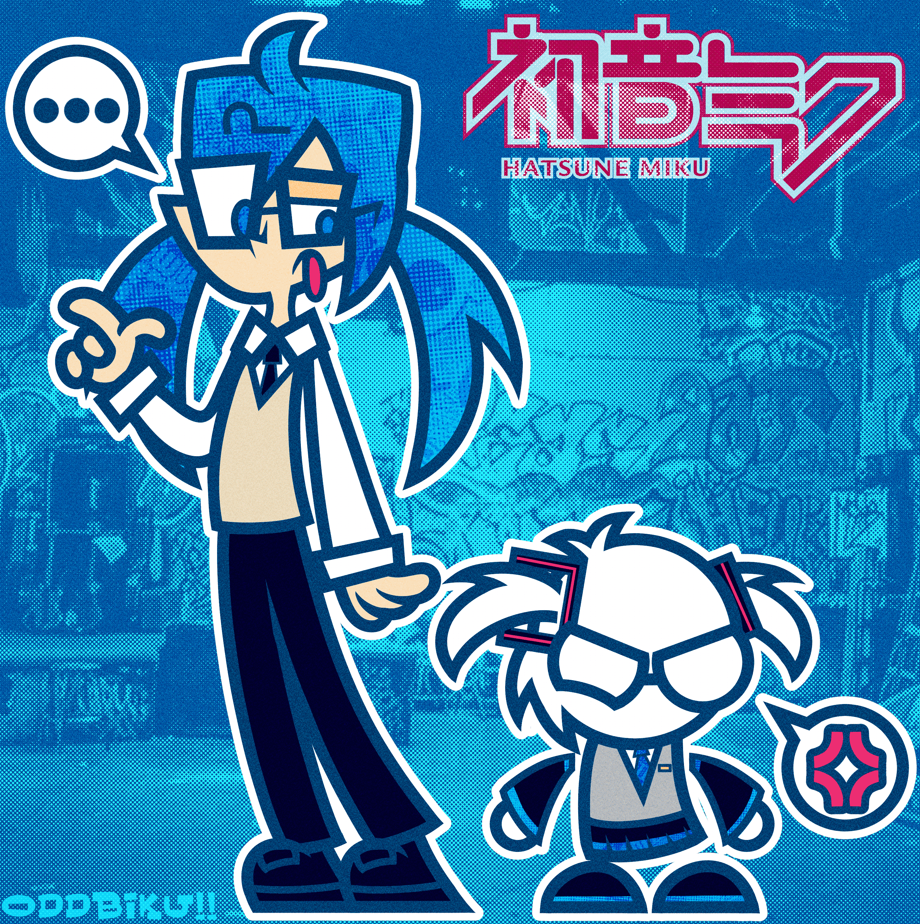
I drew this based on a pun: Hatsune Biku. Me, but as Hatsune Miku.
I tried to do an effect where an image is inside a part of the drawing and it turned out okay. This was a point where I tried to achieve the "mid-century modern" cartoon style from the 50s and 60s as you can see with Miku's head. I like the design I gave myself more than Miku's (selfish much?).
Clip Studio Paint (sketch), Inkscape (final)
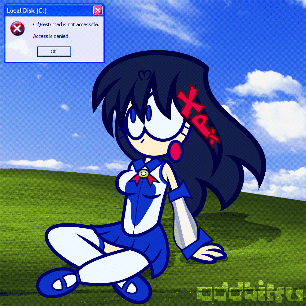
Final part of a phase where I tried to use Inkscape as my main art program. This is fan art of XP-tan, an OS-tan of Windows XP.
I kind of ripped off the hairstyle from PACAPARA's art of the character. I referenced the pose from POSEMANIACS. I really like the legs and skirt position for some reason.
Clip Studio Paint (sketch), Inkscape (final)
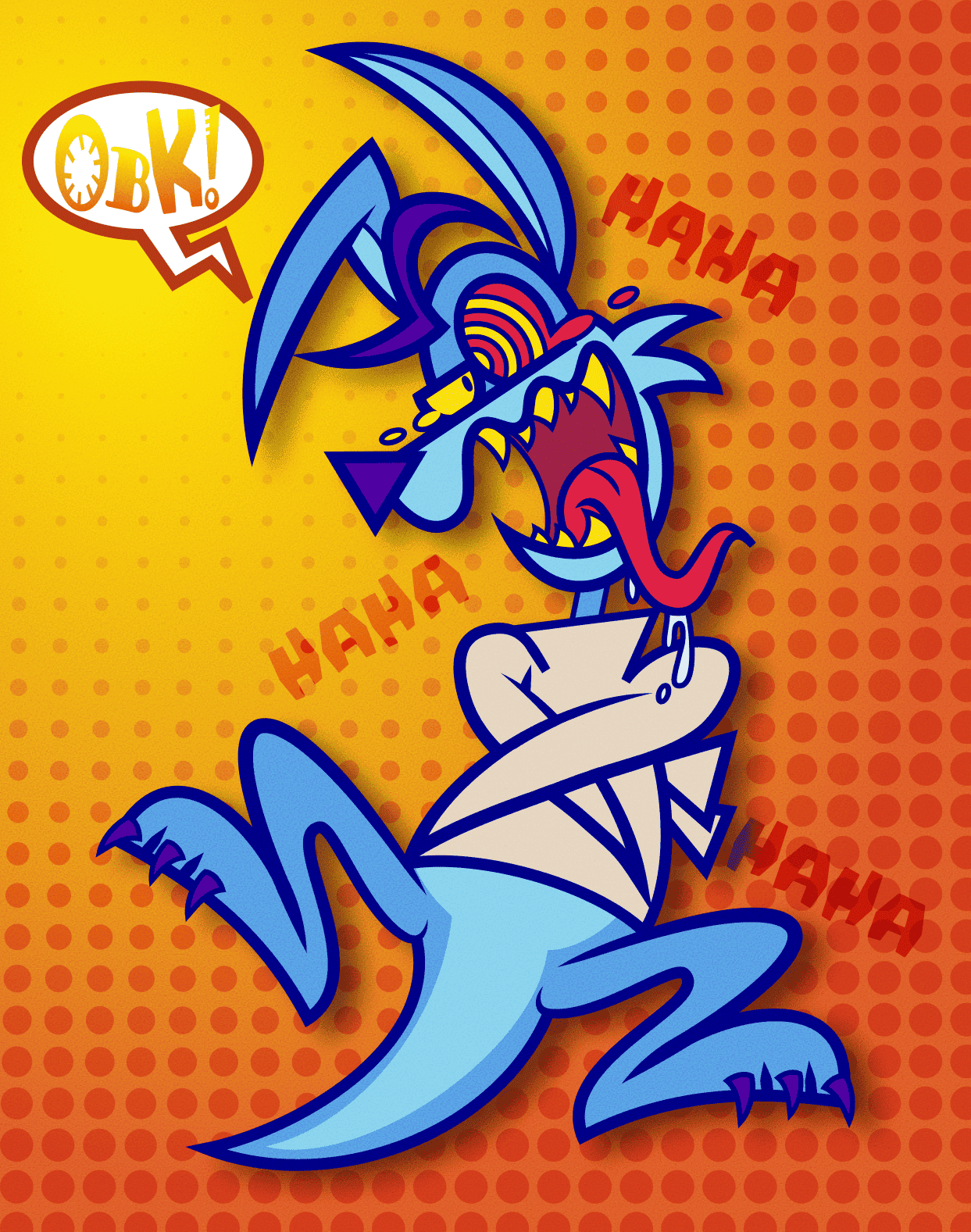
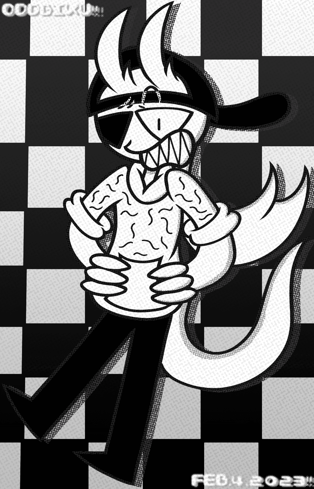
Part two of a phase where I tried to use Inkscape as my main art program. This is fan art of Ripper Roo from Crash Bandicoot, my favorite character.
This one is pretty good. I like the wild expression, the drool and tears, the sharp teeth, the way I drew the legs, the shade of blue I chose, the "HAHA"s around him, the mish-mash of fonts in the speech bubble, it's as wild as the character.
Clip Studio Paint (sketch), Inkscape (final)
Part one of a phase where I tried to use Inkscape as my main art program. This one is of my OC, Zeri. Quick and lazy.
The colors and dot effect are nice. The eyebrow style is fun. I also like the paper effect I chose.
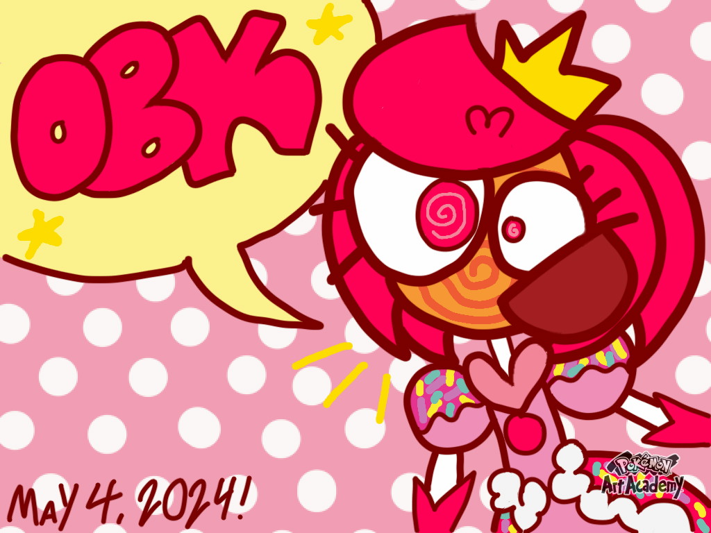
Pokemon Art Academy (Nintendo 3DS)
Fan art of Princess Loolilalu from The Amazing Digital Circus drawn on a Nintendo 3DS of all things.
You can tell that my dexterity on the 3DS isn't as smooth as my other works. I didn't use very much of the tools provided in the game.She was pretty fun to draw and a challenge to draw on a smaller screen than usual.
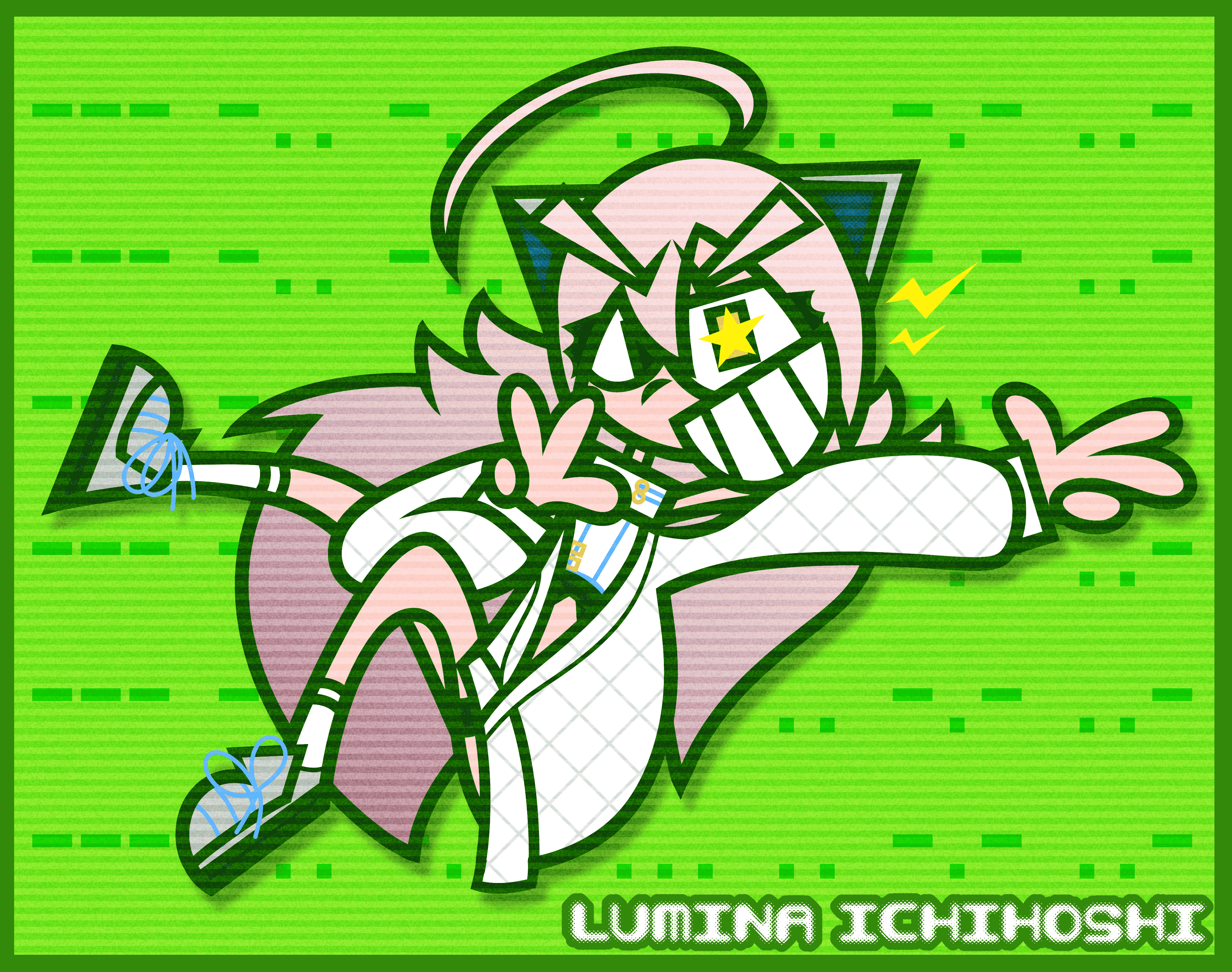
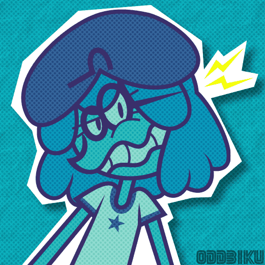
Clip Studio Paint
Fan art of Lumina Ichihoshi from D4DJ.
This was rushed as hell and I hate it. Her hair and face design are fun though. The morse code on the background translates to "ODDBIKU" (--- -.. -.. -... .. -.- ..-).
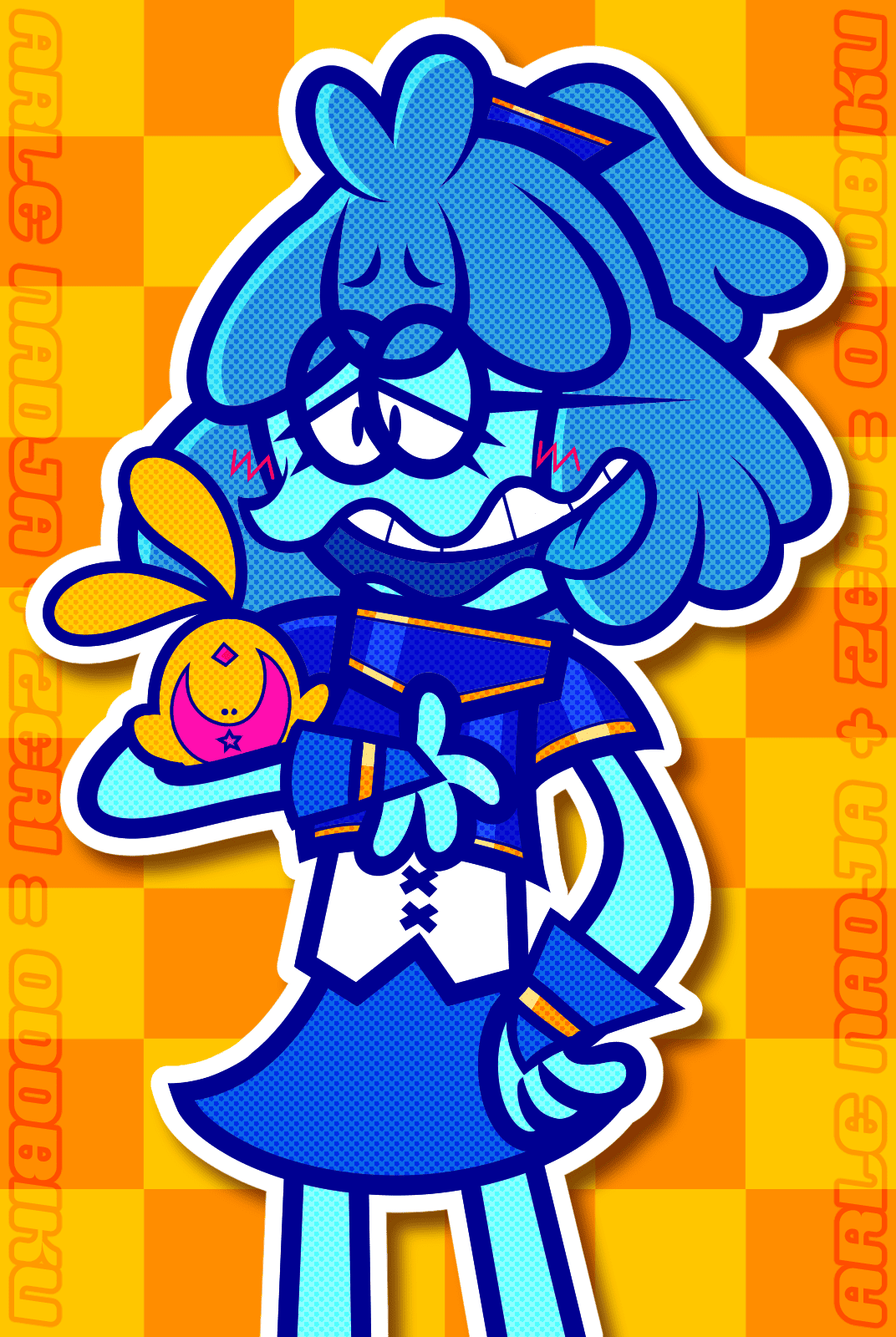
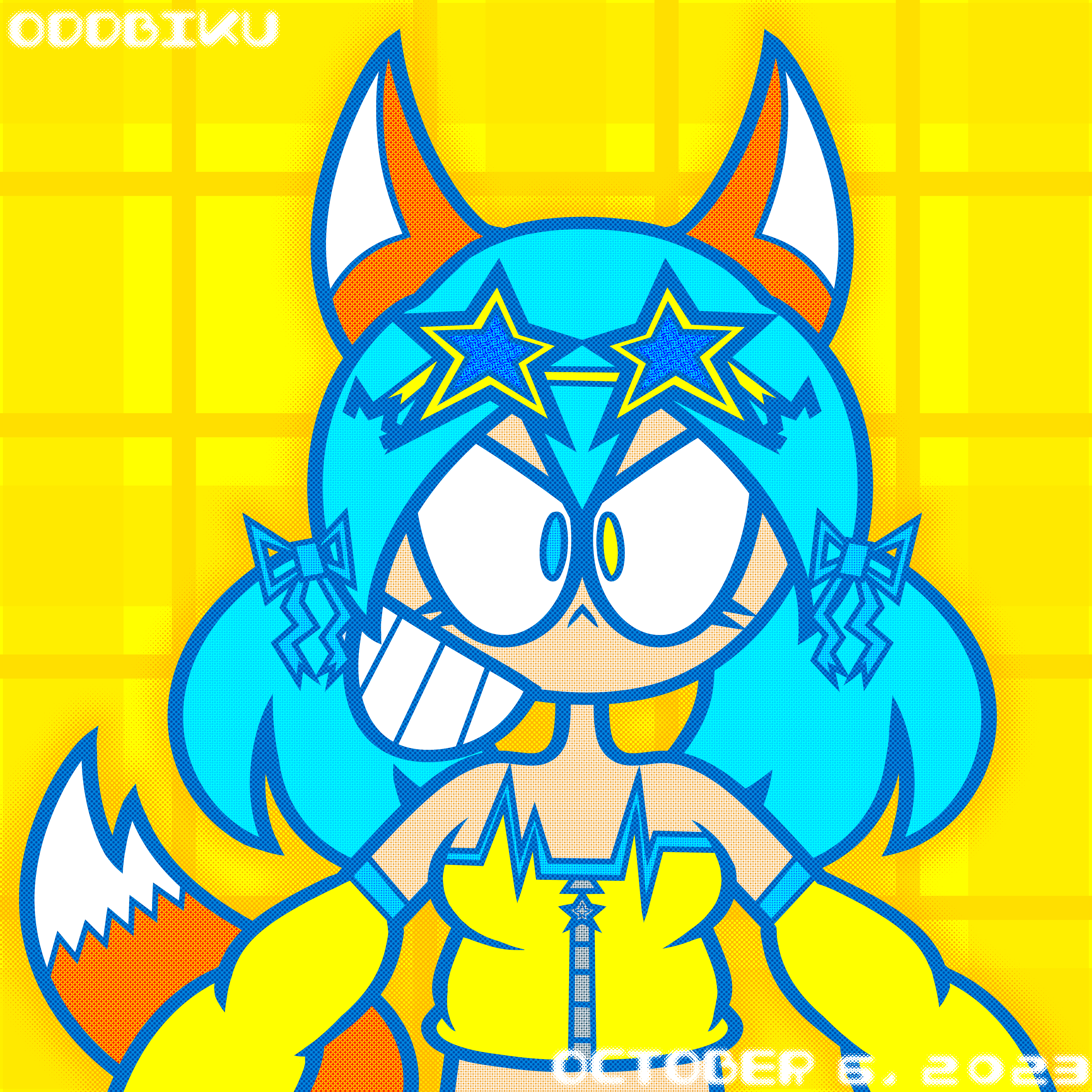
Clip Studio Paint
Almost a redraw of my OC Zeri dressed as Arle Nadja from Puyo Puyo.
The old one is from 2020 and I drew her in the SEGA version's costume. Here, I drew her with the Puyo Puyo~n costume (I forgot to draw the cape) because that game has the best designs. The blues on this one are just great. The dots and sticker pop out effect are great too. If I did draw the cape, it would be complete.
Clip Studio Paint
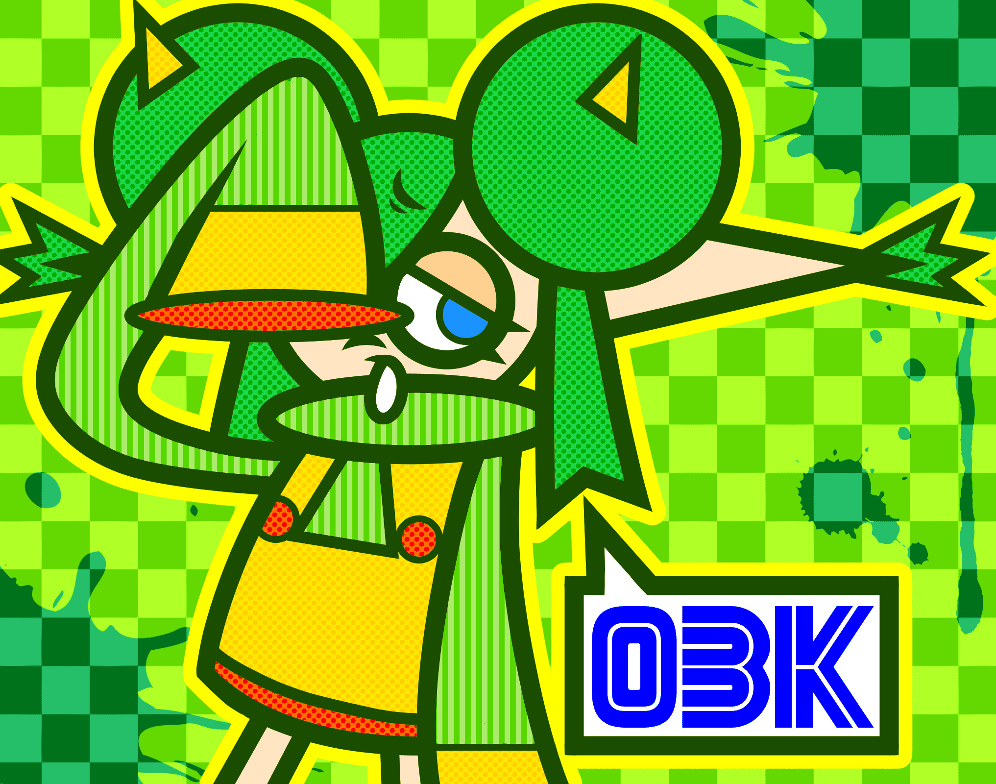
Almost a redraw of fan art of Lidelle from Puyo Puyo from 2020 (drew it in MSPaint).
This is the point where I start using "OBK" as my signature. It was inspired by graffiti writers doing those cool acronyms of their names. I really like this one. The clean line art, the expression, the patterns, the colors, it's actually good.
Clip Studio Paint
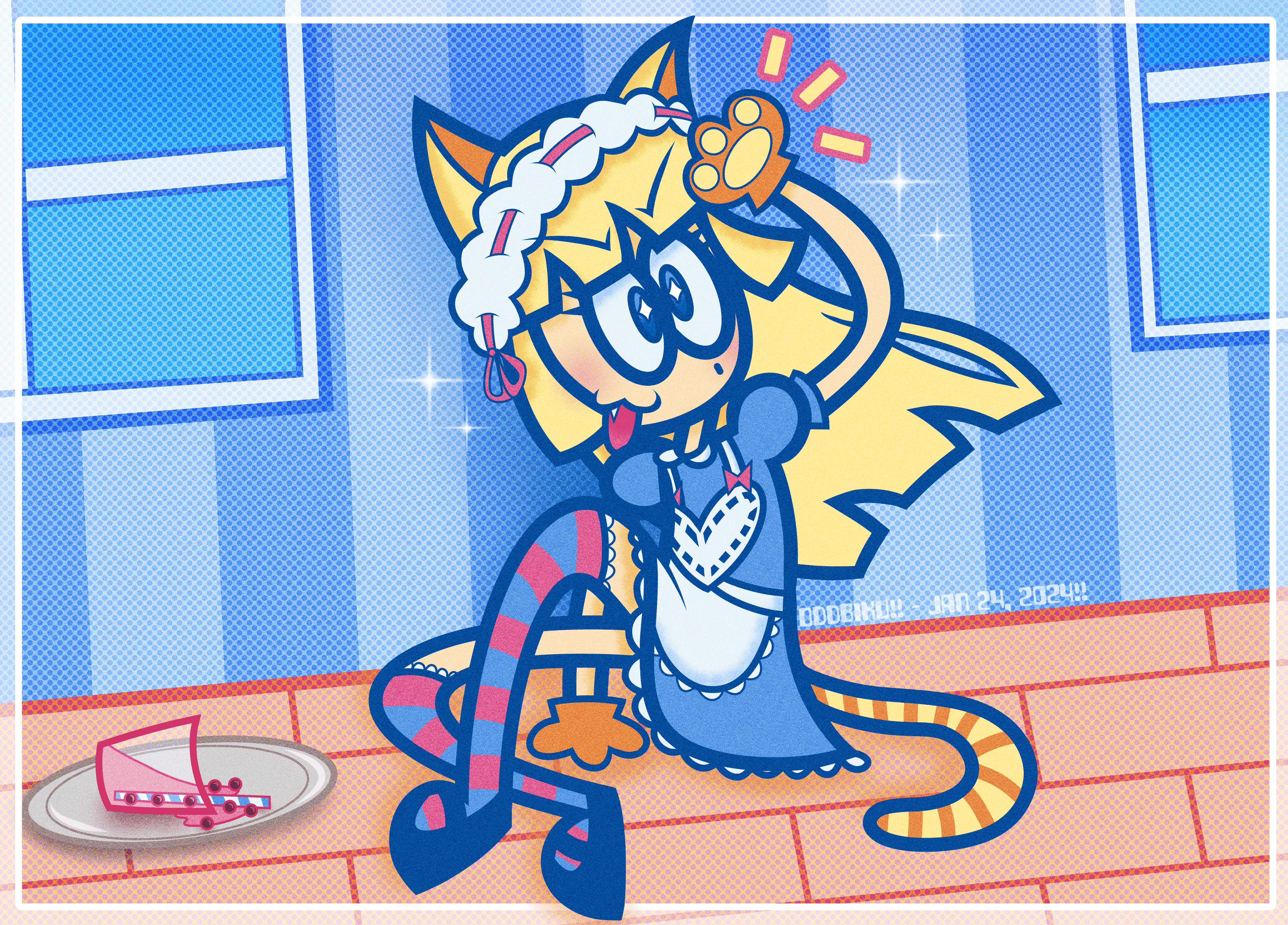
The character is by @domi__i on Instagram. Their sticker sheets are often bootlegged on AliExpress, which is how I found this character.
The concept was that she spilled a drink and she's smiling it off. The colors, effects, and white border are good, but the pose, angle, floor color, and shading where she's sitting are bad.
Clip Studio Paint
The second Pomni fan art in a row.
Another use of Magic Poser here. The idea was that it was one of those "random floating" visuals. Also, near Pomni's foot is a big stupid white dot which I forgot to erase. I tried doing something new by putting a star on one of the pupils to show shock and I think it's good. I like the shade of blue I chose, the expression, and how I gave some dimension to the door.
Clip Studio Paint
I first watched The Amazing Digital Circus on Christmas and had a phase for a bit.
I liked the song and the artwork in God-ish by Pinocchio-P, so I mashed the two together. It's not great. I do like the limited colors, eyes, and smoke trail.
Clip Studio Paint
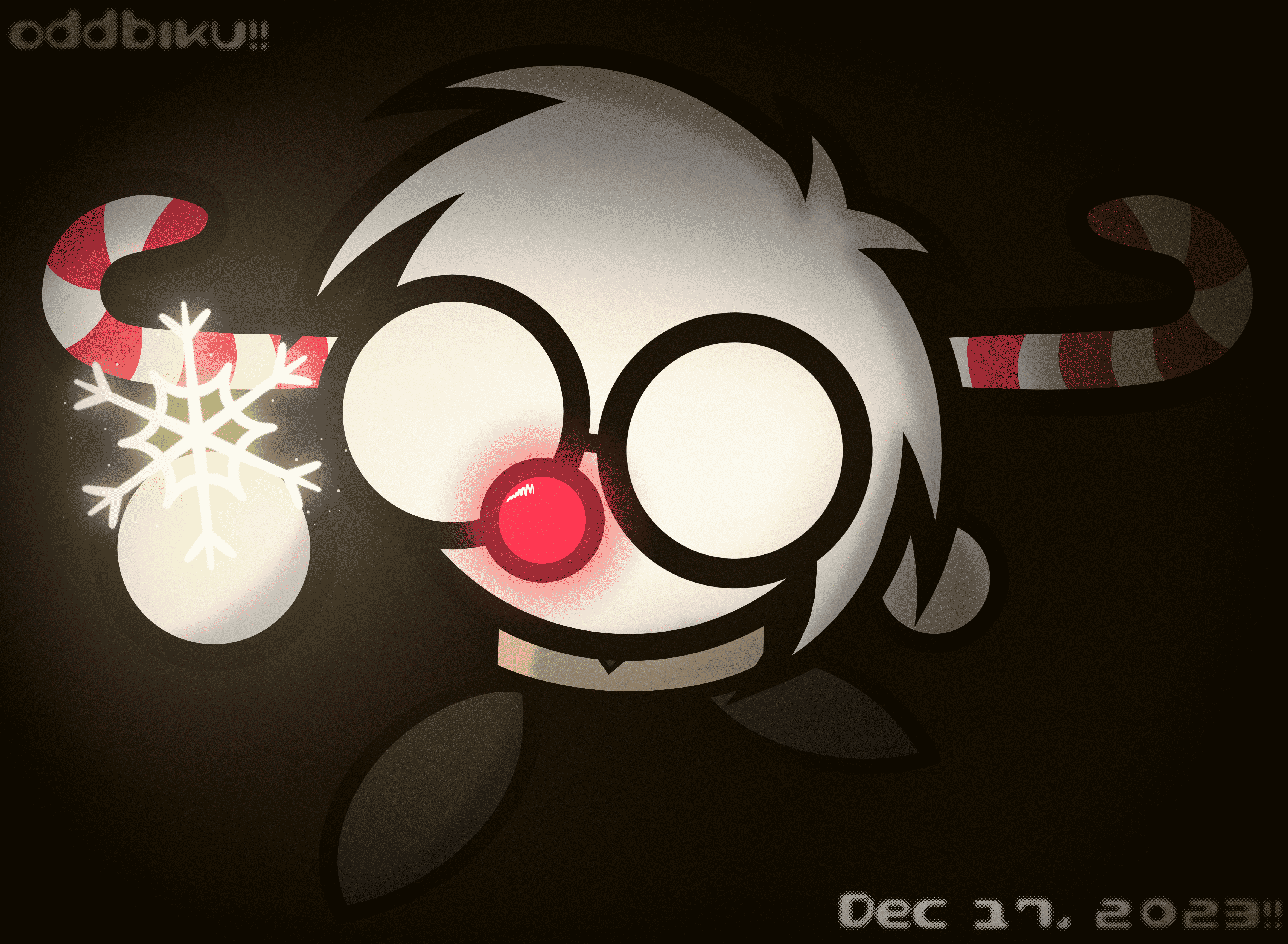
Christmas art.
The concept was a snowy night out and I find a snowflake and show you. I used the web version of Magic Poser for the perspective and it turned out alright. I remember during the making of this, I tried to apply a snow texture onto the ground, but it never worked. I'm most proud of the glow and sparkle effect on the snowflake.
Clip Studio Paint
Redraw of old fan art of Shioriko Mifune from Love Live! from 2021 (I drew that one in MSPaint LMAO).
I applied too many effects here, but they're more subtle here. I like the pupil shape, hair style and color, and simplification of her outfit details. Better than last time when I tried to get ALL of her costume details.
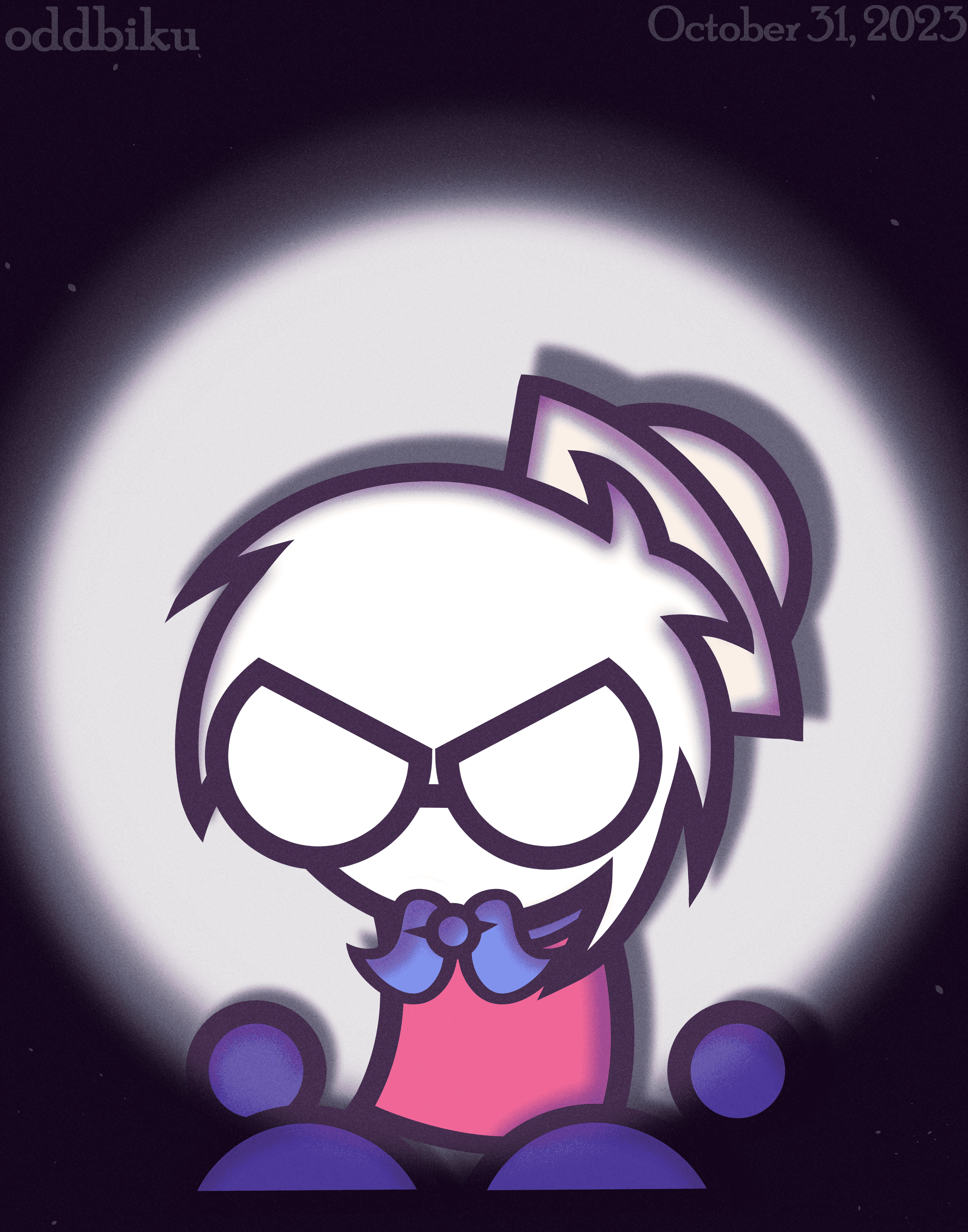
Clip Studio Paint
I was Barnacle Boy from SpongeBob for Halloween.
I wanted to try to do a dramatic spotlight effect. It came out okay. I like the grain, drop shadow, and angry expression I gave to myself.
Clip Studio Paint
Birthday art for aurorathelittlefox on Discord.
The clothing, accessories, and hairstyle were done by me while the base character is from her. Pretty basic, not too shitty. I like the shade of blue I chose for her hair and the spiky things when the glasses handles dig into the hair.
Clip Studio Paint
Some Homestar Runner fan art.
The concept was like a "rainbow comes out after the rain stops" kind of thing. The concept was interesting, but the execution isn't great. My favorite detail is the sleeves on the raincoat when he doesn't have any arms.
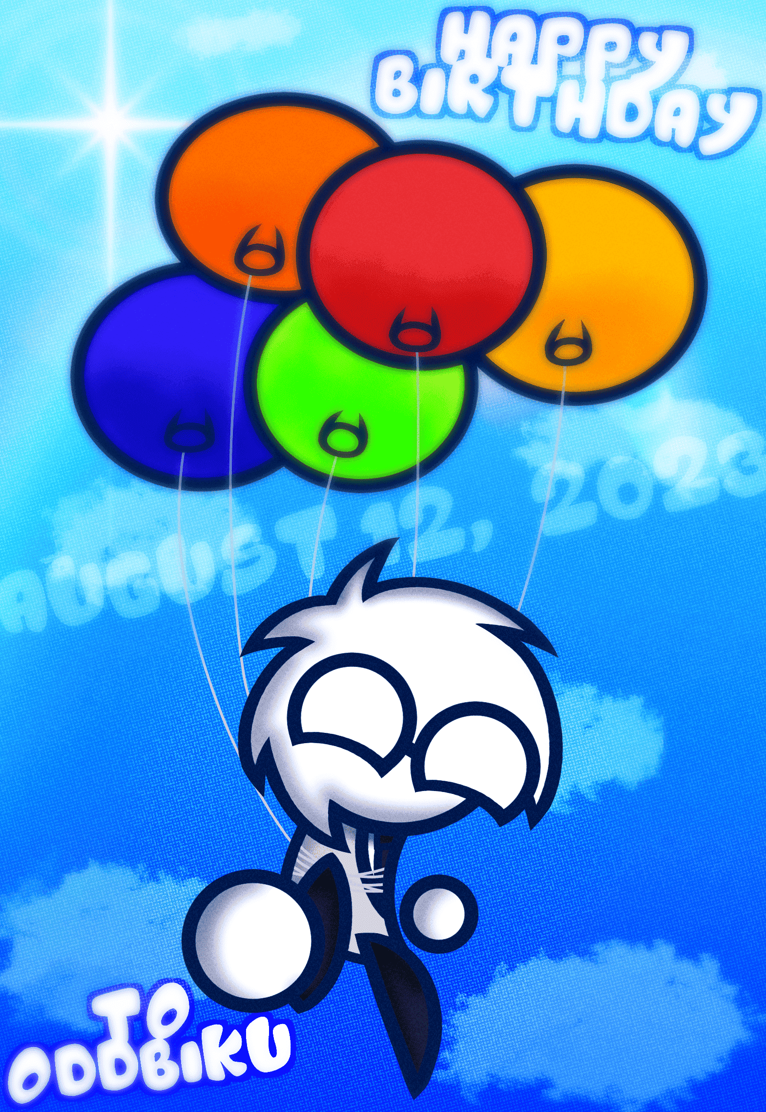
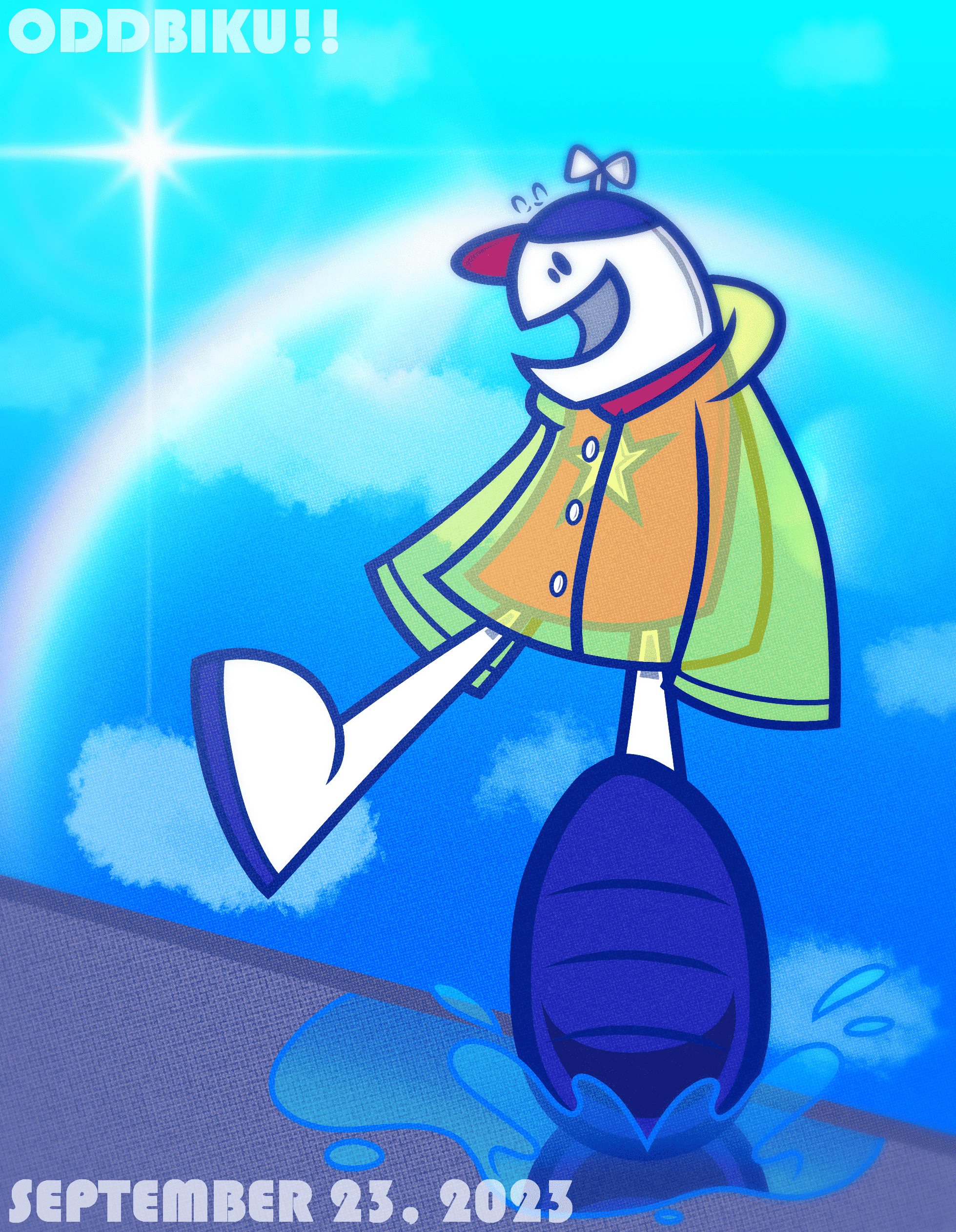
Clip Studio Paint
Birthday art for myself.
The perspective is inconsistent, the realistic clouds stick out compared to the rest of the style, you can obviously tell there is a blur effect around the image, but it's okay. The perspective and color of the balloons is good.
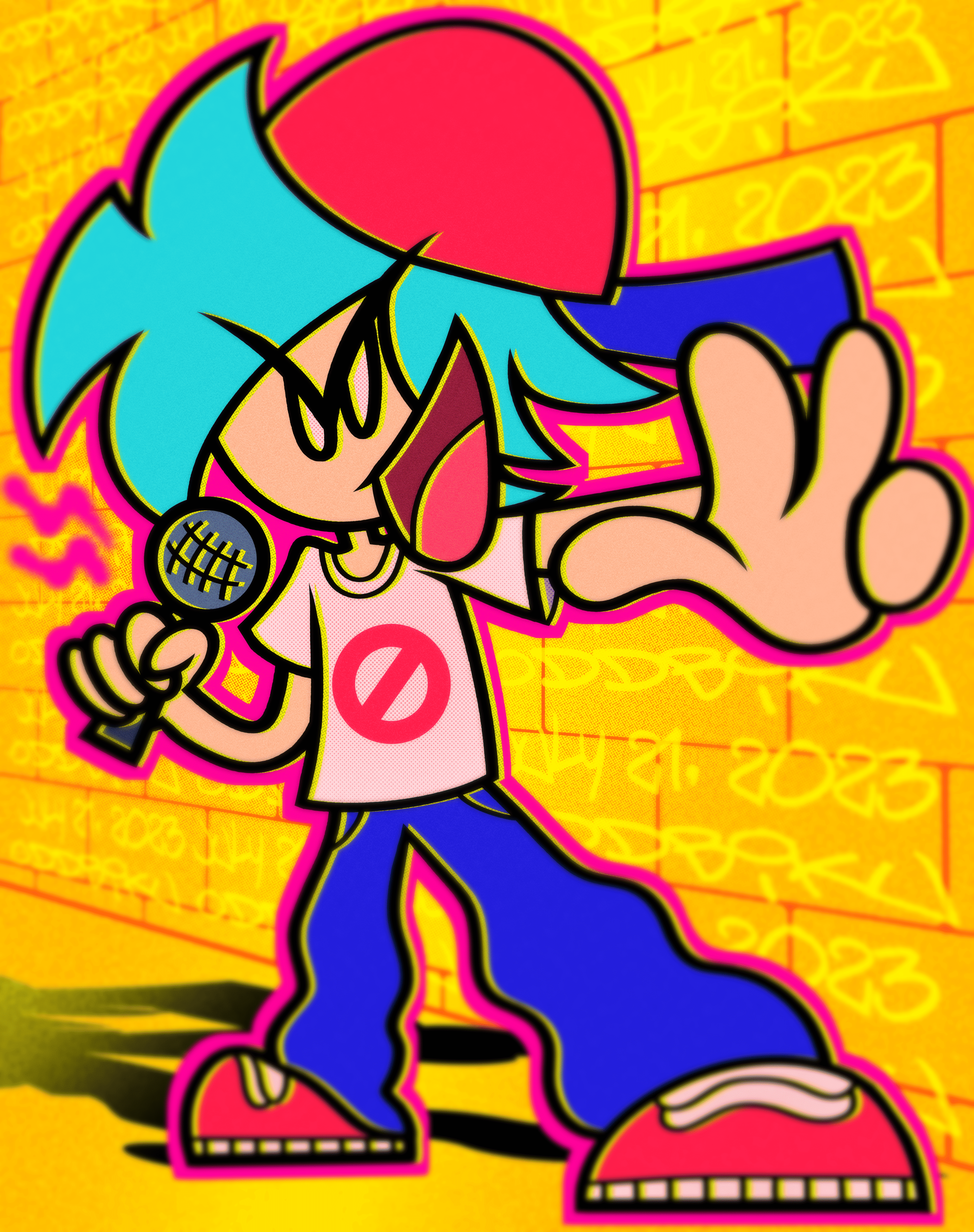
Clip Studio Paint
Redraw of some old Boyfriend from Friday Night Funkin' art I made in 2021 (originally drawn in FireAlpaca).
The colors and effects are actually pretty nice? I like the subtle dot effect on him and the pink spray outline around him.
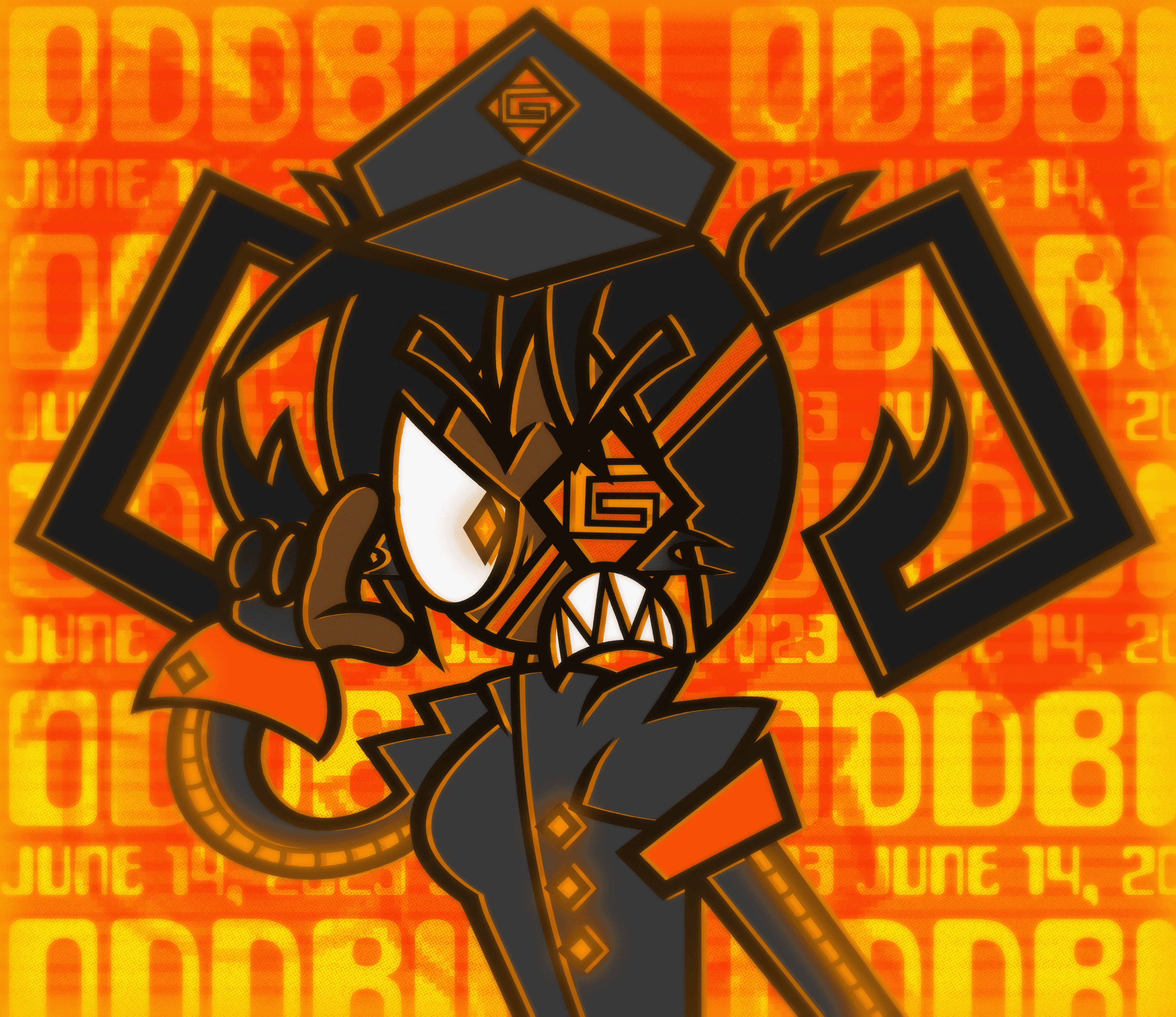
Clip Studio Paint
A gijinka of GAOMON drawing tablets (the brand I use).
I hate this one so much due to the amount of filters I used and abused. I learned them from tppo and went wild. However, the design of the character is okay. I like the hair, theme, and incorporation of the actual drawing glove.
Clip Studio Paint
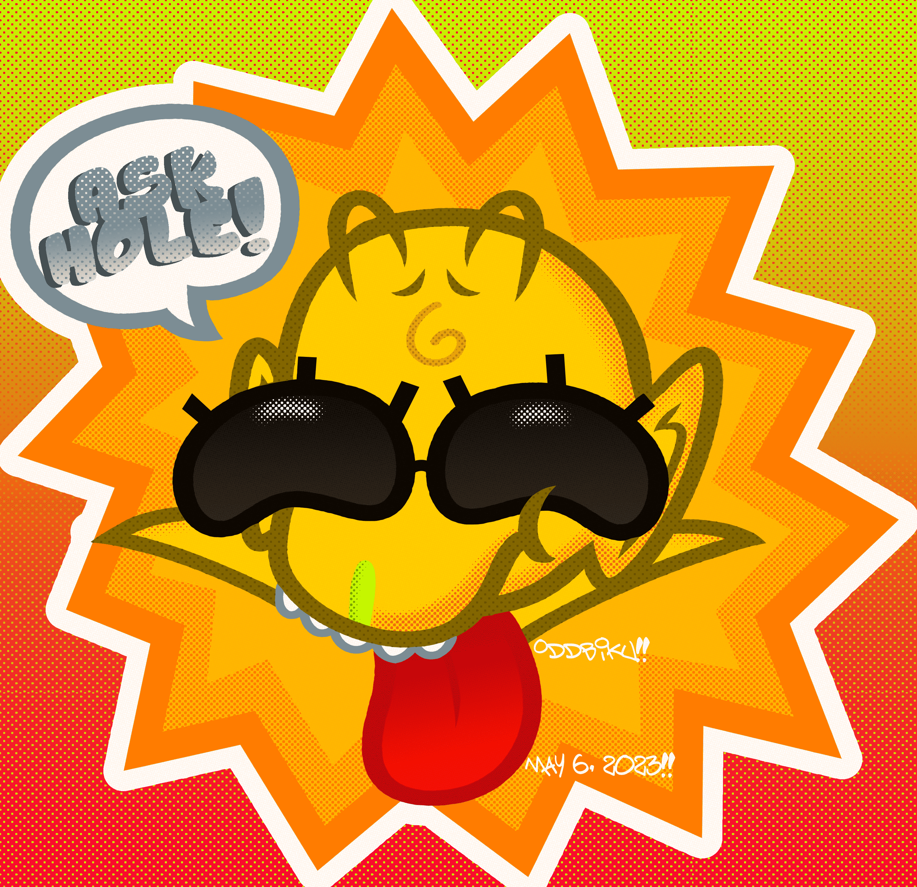
An art trade for someone on SpaceHey back when I used to use it. I don't remember their username, but they're ASKHOLE on Discord.
They had a very unique character, but I didn't do a good job of drawing them. However, they still liked it. They did a better drawing of my character though.
Clip Studio Paint
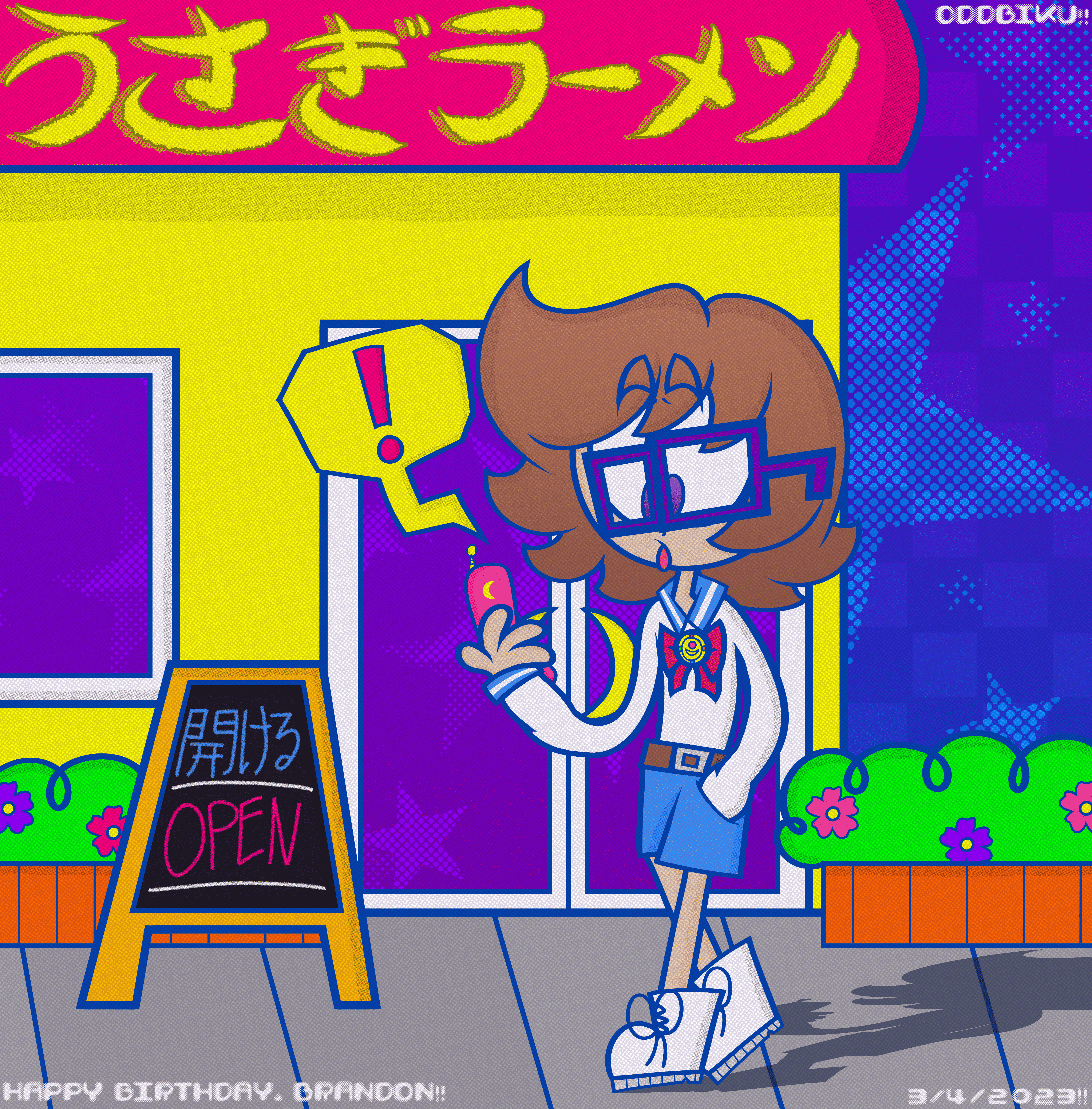
A birthday gift for my brother.
He designed the character himself with Picrew and I redrew it in my style. He has a Sailor Moon brooch on his uniform because he likes Sailor Moon. The colors and effects on this one are abysmal. The shadow on the ground is okay.
Clip Studio Paint
My first time using Clip Studio Paint featuring an unused design for one of my OCs, Plat. I didn't know things like blend modes or patterns yet, hence why it looks like shit.